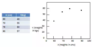
A scatterplot is a graphical way to display the relationship between two quantitative sample variables. It consists of an X axis, a Y axis and a series of dots where each dot represents one observation from a data set. The position of the dot refers to its X and Y values.
Patterns of Data in Scatterplots
Scatterplots are used to analyze patterns which generally varies on the basis of linearity, slope, and strength.
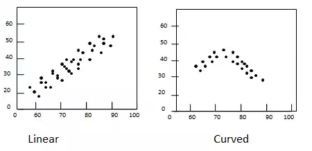
· Linearity – data pattern is either linear/straight or nonlinear/curved.
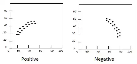
· Slope – direction of change in variable Y with respect to increase in value of variable X. If Y increases with increase in X, slope is positive otherwise slope is negative.
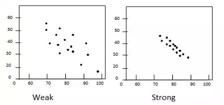
· Strength – Degree of spreadness of scatter in the plot. If dots are widely dispersed, the relationship is consider weak. If dot are densed around a line then the relationship is said to be strong.