
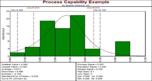
A histogram is a graphical tool used to visualize data that can be produced with histogram software such as Quality America’s SPC programs. A histogram graph is a bar chart, where the height of each bar represents the number of observations falling within a range of rank-ordered data values.
METHODOLOGY
To make a histogram graph, rank order the data from the smallest value to the largest value.
Calculate the number of bars (or cells) as approximately equal to the square root of the number of data values. The number of cells (or bars) will influence the shape of the perceived distribution, so never base it on convenience, the data resolution, or anything other than the number of data observations.
The width of each bar is calculated by dividing the range of the data (the maximum value minus the minimum value) by the number of bars.
Count the number of data observations in each bar.
The vertical axis plots the count of observations in each bar. The horizontal axis displays the data values for each bar (usually either the starting point, ending point, or midpoint).
A histogram is a graphical tool used to visualize data that can be produced with histogram software such as Quality America’s SPC programs. A histogram graph is a bar chart, where the height of each bar represents the number of observations falling within a range of rank-ordered data values.
Continuous Process Improvement
Histograms or bar charts are quality improvement tools that are instantly recognizable but are often neglected. They can offer a powerful analysis of your problems. Continuous process improvement requires that we collect data through simple quality tools such as tally charts, but then we need to be able to analyze this data. One of the simplest tools to do this with is a histogram or bar chart, a quality tool that many of us will be familiar with from school.
Histogram for Continuous Process Improvement
What Is a Histogram?
A histogram is a graphical representation of data. The data is represented by columns on a graph that vary in height depending on the frequency (how many times) the specific range of data occur.
Why use a histogram as a quality tool?
1. Displays data in an easy-to-interpret graphical manner
2. Shows frequency of occurrence of data values
3. Reveals the centering, variation and shape of the data
4. Illustrates the underlying distribution of the data
5. Enables future prediction of process performance
6. Enables identification in changes in processes parameters
7. Allows you to answer the question: “Is the process capable of meeting the customer requirements?”
Continuous process improvement is core to the survival of any business. Histograms and other quality tools are key to achieving continual process improvement of your business.
How to Make a Histogram
The first thing to do is to collect your data. We will talk about variable (measured) data for the purposes of this article. We can collect data using a tally chart, recording occurrences of specific ranges of measurement or we can just create a table of results when we take the measurements.
To use this quality tool we must draw the histogram, for this we need to know the number of “class intervals” (number of columns) and the “interval width” (the width of each column on our bar chart).
Plotting Your Histogram
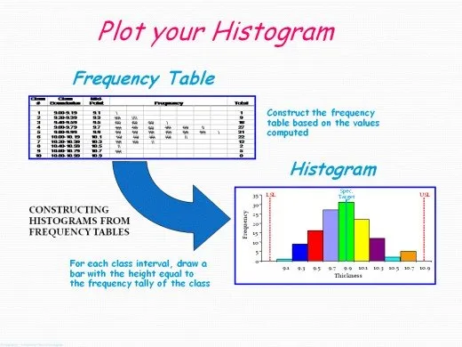
Class Intervals on Your Bar Chart
To define the number of class intervals, the “official” method is to take the square root of the total number of measurements, for example if you have 400 measurements then the class interval will be 20. However, if you are not too comfortable with square roots the following table can be used as a simple guide.
Number of Samples Class Intervals
· Under 50: 5–7
· 50–100: 6 – 10
· 100–250: 7–12
· Over 250: 10–20
This will tell you how many individual columns will form your histogram or bar chart when you use this simple quality