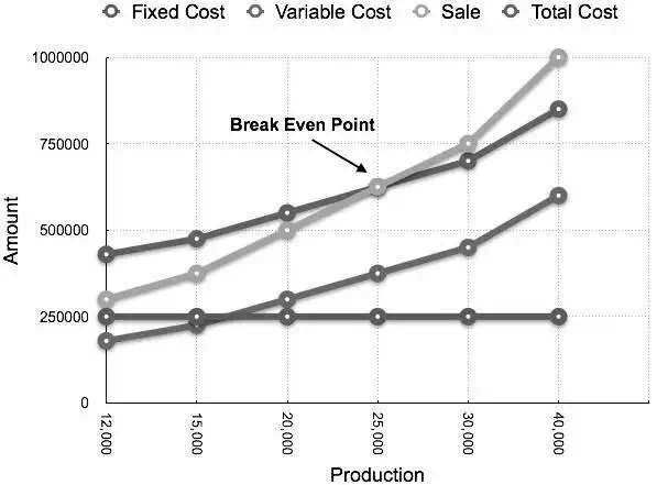
Break-Even Chart is the most useful graphical representation of marginal costing. It converts accounting data to a useful readable report. Estimated profits, losses, and costs can be determined at different levels of production. Let us take an example.
Example
Calculate break-even point and draw the break-even chart from the following data:
Fixed Cost = Rs 2,50,000
Variable Cost = Rs 15 per unit
Selling Price = Rs 25 per unit
Production level in units 12,000, 15,000, 20,000, 25,000, 30,000, and 40,000.
Solution:
B.E.P =
Fixed CostContribution per unit
=
Rs 2,50,000Rs 10 × (Rs 25 – Rs 15)
= 25,000 units
At production level of 25,000 units, the total cost will be Rs 6,25,000.
(Calculated as (25000 × 14) + 2,50000)
| Statement showing Profit & Margin of safety at different level of production Break Even Sale = Rs 6,25,000 (25,000 x 25) | ||||
| Production(In Units) | Total Sale(In Rs) | Total Cost(In Rs) | Profit(Sales – Cost)(In Rs) | Margin of safety(Profit/Contribution per unit)(In Units) |
| 12000 | 3,00,000 | 4,30,000 | -1,30,000 | |
| 15000 | 3,75,000 | 4,75,000 | -1,00,000 | |
| 20000 | 5,00,000 | 5,50,000 | -50,000 | |
| 25000 | 6,25,000 | 6,25,000 | (B.E.P) | (B.E.P) |
| 30000 | 7,50,000 | 7,00,000 | 50,000 | 5,000 |
| 40000 | 10,00,000 | 8,50,000 | 1,50,000 | 15,000 |
The corresponding chart plotted as production against amount appears as follows: