
Definition of Cause & Effect Diagram
The cause & effect diagram is the brainchild of Kaoru Ishikawa, who pioneered quality management processes in the Kawasaki shipyards, and in the process became one of the founding fathers of modern management. The cause and effect diagram is used to explore all the potential or real causes (or inputs) that result in a single effect (or output). Causes are arranged according to their level of importance or detail, resulting in a depiction of relationships and hierarchy of events. This can help you search for root causes, identify areas where there may be problems, and compare the relative importance of different causes.
Causes in a cause & effect diagram are frequently arranged into four major categories. While these categories can be anything, you will often see:
- manpower, methods, materials, and machinery (recommended for manufacturing)
- equipment, policies, procedures, and people (recommended for administration and service).
These guidelines can be helpful but should not be used if they limit the diagram or are inappropriate. The categories you use should suit your needs. At SkyMark, we often create the branches of the cause and effect tree from the titles of the affinity sets in a preceding affinity diagram.
The C&E diagram is also known as the fishbone diagram because it was drawn to resemble the skeleton of a fish, with the main causal categories drawn as “bones” attached to the spine of the fish, as shown below.
The fishbone diagram, as originally drawn by Kaoru Ishikawa, is the classic way of displaying root causes of an observed effect
Cause & effect diagrams can also be drawn as tree diagrams, resembling a tree turned on its side. From a single outcome or trunk, branches extend that represent major categories of inputs or causes that create that single outcome. These large branches then lead to smaller and smaller branches of causes all the way down to twigs at the ends. The tree structure has an advantage over the fishbone-style diagram. As a fishbone diagram becomes more and more complex, it becomes difficult to find and compare items that are the same distance from the effect because they are dispersed over the diagram. With the tree structure, all items on the same causal level are aligned vertically.
History
Ishikawa diagram, in fishbone shape, showing factors of Equipment, Process, People, Materials, Environment and Management, all affecting the overall problem. Smaller arrows connect the sub-causes to major causes.
Ishikawa diagrams were proposed by Kaoru Ishikawa in the 1960s, who pioneered quality management processes in the Kawasaki shipyards, and in the process became one of the founding fathers of modern management.
It was first used in the 1960s, and is considered one of the seven basic tools of quality control. It is known as a fishbone diagram because of its shape, similar to the side view of a fish skeleton.
Mazda Motors famously used an Ishikawa diagram in the development of the Miata sports car, where the required result was “Jinba Ittai” or “Horse and Rider as One”. The main causes included such aspects as “touch” and “braking” with the lesser causes including highly granular factors such as “50/50 weight distribution” and “able to rest elbow on top of driver’s door”. Every factor identified in the diagram was included in the final design. The Cause & Effect (CE) diagram, also sometimes called the ‘fishbone’ diagram, is a tool for discovering all the possible causes for a particular effect. The effect being examined is normally some troublesome aspect of product or service quality, such as ‘a machined part not to specification’, ‘delivery times varying too widely’, ‘excessive number of bugs in software under development’, and so on, but the effect may also relate to internal processes such as ‘high rate of team failures’.
The major purpose of the CE Diagram is to act as a first step in problem solving by generating a comprehensive list of possible causes. It can lead to immediate identification of major causes and point to the potential remedial actions or, failing this, it may indicate the best potential areas for further exploration and analysis. At a minimum, preparing a CE Diagram will lead to greater The CE Diagram was invented by Professor Kaoru Ishikawa of Tokyo University, a highly regarded Japanese expert in quality management. He first used it in 1943 to help explain to a group of engineers at Kawasaki Steel Works how a complex set of factors could be related to help understand a problem. CE Diagrams have since become a standard tool of analysis in Japan and in the West in conjunction with other analytical and problem-solving tools and techniques.
CE Diagrams are also often called Ishikawa Diagrams, after their inventor, or Fishbone Diagrams because the diagram itself can look like the skeleton of a fish.
Typical categories are:
The 4 M’s (used in manufacturing) understanding of the problem.
- Machine (Technology)
- Method (Process/Inspection)
- Material (Raw, Consumables etc.)
- Man Power (physical work)/Mind Power (Brain Work): Kaizens, Suggestions
The 8 P’s (used in service industry)
- Product=Service
- Price
- Place
- Promotion
- People
- Process
- Physical Evidence
- Productivity & Quality
The 4 S’s (used in service industry)
- Surroundings
- Suppliers
- Systems
- Skills
More M’s
- Mother Nature (Environment)
- Measurement (Inspection)
- Maintenance
- Money Power
- Management
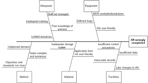
Example of cause effect diagram
Step 1
down the effect to be investigated and draw the ‘backbone’ arrow to it. In the example shown below the effect is ‘Incorrect deliveries’.
Step 2
Identify all the broad areas of enquiry in which the causes of the effect being investigated may lie. For incorrect deliveries the diagram may then become:
For manufacturing processes, the broad areas of enquiry which are most often used are Materials (raw materials), Equipment (machines and tools), Workers (methods of work), and Inspection (measuring method).
Step 3
This step requires the greatest amount of work and imagination because it requires you (or you and your team) to write in all the detailed possible causes in each of the broad areas of enquiry. Each cause identified should be fully explored for further more specific causes which, in turn, contribute to them.
You continue this process of branching off into more and more directions until every possible cause has been identified. The final result will represent a sort of a ‘mind dump’ of all the factors relating to the effect being explored and the relationships between them.
Different types of CE Diagram
There are three different types of CE Diagram. The basic type explained above is called the Dispersion analysis type. The other two are the Production process classification type and the Cause enumeration type.
Production classification type
This type differs from the basic type above in that each discrete stage in the production process leading up to the effect being examined is shown along the main arrow or ‘backbone’ of the diagram. Possible causes are then shown as branches off these as shown in the illustration overleaf.
This type of CE Diagram is often easier to construct and understand because those involved are already familiar with each of the production steps identified.
Cause enumeration type
This is not so much a different type of diagram but a different method of constructing a diagram. Instead of building up a chart gradually (starting with the ‘backbone’, deciding broad areas, then adding more and more branches), you postpone drawing the chart and simply list all the possible causes first. Then draw the chart in order to relate the causes to each other. This method has the advantage that the list of possible causes will be more comprehensive because the process has a more free-form nature. The disadvantage is that it is more difficult to draw the diagram from this list rather than from scratch.
This method of drawing a CE Diagram can be used in conjunction with Brainstorming by using it to distil the brainstorm output down into a logical and useable set of information.
Good and bad CE diagrams
A good CE diagram is one which explores all possibilities so it is likely to be large and complex-looking as twig after twig sprouts for each new related idea noted down. Be suspicious of CE Diagrams with few factors, or which are neat and well ordered. These may reflect a lack of knowledge of the situation, or show that the effort to draw the diagram was not creative and exhaustive enough.
The cause and effect diagram can also be drawn with right angles, which makes it less tangled, and easier to see what layer of causality is being considered at any given time.