

Scatter Diagram or correlation diagram is a tool to describe changes in a dependent variable in relation to any change in the independent variable.
“A correlation chart that uses a regression line to explain or to predict how the change in an independent variable will change a dependent variable.”
This is basically an analysis of influence that comes from an independent variable to the corresponding dependent variable, and if there is a correlation whether positive or negative, and that is represented by a regression line. This tool is used normally when Quality Control finds a variable that is not in control and systematically changing with another variable. A variable that is influencing other variable is called an independent or control parameter.
Scatter Diagram is plotted where the independent variable is plotted along the horizontal axis and the dependent variable is plotted along the vertical axis.
Scatter Diagram can also be created with two variables even there is no control parameter, in this case either type of parameter can be plotted on either axis. In this case the main objective just to show any degree of correlation between two variables.
Type of Correlation:
1. Positive: In this case pattern of observations slant from lower left to upper right of the chart. When a value of independent variable gets increase, as a result value of dependent variable also gets increased. For example productivity of a team member gets increase with its experience.
2. Negative: In this case pattern of observations slant from upper left to lower right of the chart. Value of dependent variable gets to decrease if value of independent variable gets the increase. For example number of farm workers in country, decreasing in years.
3. Null: There is no correlation between two variables and observations are scattered into the chart. For example, this is baseless to find correlation in number of vacations sanctioned to a team member as per their height.
The positive and negative correlation can be further categorized like:
Strong Positive Correlation: The value of dependent variable clearly increases as the value of independence increases.
v Weak Positive Correlation: The value of dependent variable increases slightly as the value of independent variable increases.
v Strong Negative Correlation: The value of dependent variable clearly decreases as the value of independent variable increases.
v Weak Negative Correction: The value of dependent variable decreases slightly as the value of independent variable increases.
v Complex Correlation: The value of dependent variable seems to be related to the independent variable.
Correlation may be identified when there is a cause and effect relationship between two parameters. In case there is strong relationship, then we can put efforts to strengthen or weaken (based on positive or negative correlation) the independent parameter to get the desired values of the dependent variable.
Development of Scatter Diagram:
To explain the development of the scatter plot, I am taking the example of WIP (Work in Process) limit, throughput and Cycle time; it seems that the WIP limit highly influence the cycle time of products
Here Cycle time means the average time between deliveries of completed work items.
Before development, First and foremost step is to understand cause and effect relationship between WIP and Cycle time, as Scatter plot is normally developed when there is a mathematical relationship between two variables.
In regards to WIP, if lot of items are put in-process then we need to put efforts to plan, execute, monitor & control and close of all the items involved and it would impact cycle time of products. WIP is a management decision and is based on the analysis of work flow; as a result, we need to understand the flow of work.
In case of constant throughput, WIP and cycle time is proportional. If throughput is held constant, it is impossible to reduce average cycle time without reducing the average WIP limit. Here throughput is the velocity or speed of production and velocity is well defined for the team and hence it is constant.
In other words, it is important to understand mathematical relationships between two variables and to know which is dependent and which is independent. Here WIP is the independent variable and cycle time is a dependent variable.
Assume a project with a capacity of 500 user story points per week, under this assumption, if we start 500 story points or less in each week, the cycle time for each will be one week (because we have enough capacity to process them all during the week).
However, suppose that we start out with a backlog of 500 story points. Each week we get 500 more in, so that the total WIP is 1000. We can only process 500 of the story points in a given week. On average, each story point will spend two weeks in the process (one week waiting in the backlog of other story points to be processed, the next week being processed). Similarly, if we have 1500 story points in the process at a time, the average cycle time will be 3 weeks, etc. This is shown in the scatter graph below:
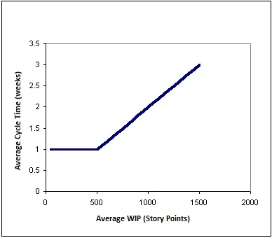
This is an example of strong positive relationship between two variables.
Another way of looking this, the following graph shows the relationship between average throughput and average WIP. According to the capacity of the process, the throughput will be equal the amount that we start per week. However, when the WIP in the processes reaches the capacity of 500 story points per week, throughputs can no longer increase. No matter how much WIP we pack into this process, we will never get more than 500 story points per week out (without increasing the process capacity in some way). And, as shown in the first chart, the more WIP we pack in, the longer the average cycle time will be.
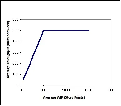
So we can conclude: Start exactly 500 story points each week. This will maximize throughput, while cycle time remains at the minimum of one week.
Usage of Scatter Diagram:
A Scatter Diagram is used to understand the influence of the independent variable to the dependent variable, and what is the best fit to get the desired value of the dependent variable.
Scatter Diagram is used in “Plan Quality” process as a preventive approach with the help of historical records to set quality policies for the independent variable to get the desired value of the dependent variable.
A Scatter Diagram is used in “Control Quality” process as a corrective action approach to understand causes of poor performance of dependent variable due to independent variable effect.
To conclude, a scatter plot is a mechanism to understand the influence of independent variable over dependent variable.