
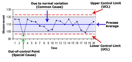
Control charts have long been used in manufacturing, stock trading algorithms, and process improvement methodologies like Six Sigma and Total Quality Management (TQM). The purpose of a control chart is to set upper and lower bounds of acceptable performance given normal variation. In other words, they provide a great way to monitor any sort of process you have in place so you can learn how to improve your poor performance and continue with your successes.
The control chart serves to “sound the alarm” when a process shifts (for instance, a machine suddenly breaking on a factory floor) or if someone has a breakthrough that needs to be documented and standardized across the larger organization. Simply put (without taking anomalies into consideration), you’ll know something needs to be fixed if you’re below your lower control limit or above your upper control limit. See the control chart example below:
Control Charts At Work In 2 Industries
In industrial settings, control charts are designed for speed: The faster the control charts respond following a process shift, the faster the engineers can identify the broken machine and return the system back to producing high-quality products. At a factory, a lag in testing could mean that thousands of parts are produced incorrectly before anyone notices the machine is broken, which results in wasted time and materials, as well as angry customers.
In nonprofit organizations, a control chart could be used to determine when an online donation system has broken down. If the website goes offline, halting critical donations, the leadership team can quickly alert IT and ensure the page gets back up and running quickly. Alternatively, seeing a major jump in donations likely means something good is happening—be it world events or a successful marketing campaign. Either way, leadership should know as soon as possible when donation activity changes.
· Budget: You can use your control charts to examine your percentage of spend each month. If you spend over 15% of your budget in one particular spring month, that is extremely helpful to know right away so you can cut back over the rest of the year. Or, if you spend less than 8% of your budget for a couple months in a row, you’ll know you may have a little wiggle room in the months to come.
· Retention rate: Some organizations feel like they need a little turnover to keep the organization healthy. If you’re retaining your talent at a rate above your normal control limit, you’ll know that you may not be evaluating staff very selectively. You’ll want to be sure to identify the reasons you may be retaining so many employees to see if this is positive news or if an HR process is broken. But if your retention rate is increasing or it drops below your lower control limit, you’ll be able to determine how to move that trend the other direction and dedicate more resources to recruiting for a period of time.
· Employee or citizen surveys: At ClearPoint, we do quarterly customer support feedback surveys to see how our clients feel we’re doing. If we’re doing something that is having a positive effect, we want to know what it is and continue to do it well. But if we’re falling below our normal control limit, we’ll want to note that something needs to change. This could be anything from having better customer service response time to changing a particular feature in our software that is frustrating or difficult to use.
Control charts have long been used in manufacturing, stock trading algorithms, and process improvement methodologies like Six Sigma and Total Quality Management (TQM). The purpose of a control chart is to set upper and lower bounds of acceptable performance given normal variation. In other words, they provide a great way to monitor any sort of process you have in place so you can learn how to improve your poor performance and continue with your successes.
The control chart serves to “sound the alarm” when a process shifts (for instance, a machine suddenly breaking on a factory floor) or if someone has a breakthrough that needs to be documented and standardized across the larger organization. Simply put (without taking anomalies into consideration), you’ll know something needs to be fixed if you’re below your lower control limit or above your upper control limit. See the control chart example below