
A sales manager opens a spreadsheet before the weekly meeting and sees that revenue is on target. That sounds reassuring—until a closer look shows that several large deals have stalled, response times have slipped, and two experienced representatives are carrying most of the pipeline.
At the same time, a customer support lead may see that the team closed more tickets than usual. Yet customer complaints are rising because agents are closing simple cases quickly while difficult cases wait too long. A single number rarely tells the whole operational story.
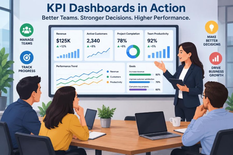
This is where a well-designed KPI dashboard becomes useful. It gives managers a shared view of the signals that matter, helping them move from impressions and isolated reports to more informed conversations and decisions.
Used poorly, dashboards can create pressure, confusion, or a misleading sense of control. Used thoughtfully, they can connect daily work to business performance without reducing people to a row of numbers.
🧭 What a KPI Dashboard Actually Does
A key performance indicator, or KPI, is a measurable sign of progress toward an important objective. A KPI dashboard brings selected indicators into one visual workspace so users can monitor performance, spot changes, and investigate what needs attention.
It is not simply a collection of charts. A useful dashboard answers practical questions: Are we progressing toward the goal? Where is performance changing? Which team, process, or customer group needs a closer look?
For example, an operations dashboard might combine order volume, on-time delivery, return reasons, and unresolved supplier issues. The combination provides context that none of those measures could offer alone.
🎯 Starting With Decisions, Not Visuals
The strongest dashboards are designed around decisions people need to make. Before choosing a chart or connecting data, managers should ask what action the information is meant to support.
If a department head needs to decide whether to add staff, relevant measures may include workload, backlog age, service demand, and quality outcomes. A decorative gauge showing general “productivity” does little to support that decision.
- What decision will this metric inform?
- Who is expected to act on it?
- How often can they realistically act?
- What additional context is needed before acting?
Beginning with these questions prevents dashboards from becoming digital noticeboards full of interesting but unused data.
🗺️ Linking Daily Work to Business Goals
Business objectives are often broad: retain customers, improve cash flow, grow revenue, reduce errors, or develop capability. Teams need to see how their everyday work contributes to those goals.
A service team, for instance, may influence retention through first-response time, resolution quality, repeat-contact rate, and customer feedback. These are not identical to retention, but they are plausible operational drivers that the team can influence directly.
This connection matters because people cannot manage a distant outcome effectively if they have no visibility of the work that shapes it. Dashboards can make the chain from activity to outcome more visible.
⚖️ Leading and Lagging Indicators
A lagging indicator reports an outcome after it has happened, such as monthly profit, employee turnover, or quarterly customer retention. These measures are necessary because they reveal whether the organization ultimately achieved its aim.
A leading indicator is an earlier signal that may influence a future result. Examples include the age of sales opportunities, completion of onboarding steps, preventive maintenance completion, or the volume of unresolved customer issues.
Neither type is sufficient alone. A lagging measure can show that a problem exists too late to prevent it, while a leading measure can encourage activity that does not produce the expected result. Good dashboards pair outcomes with meaningful drivers.
📏 Choosing Measures Teams Can Influence
Teams should be held accountable primarily for measures within their reasonable influence. Asking a help-desk team to “own” company-wide revenue can feel abstract and unfair, even though their service may affect customer loyalty.
Instead, managers can connect the team to controllable measures such as response quality, resolution time by issue type, knowledge-base usefulness, and escalation patterns. These measures support better conversations about process, skills, and resources.
A KPI is most useful when employees can see a credible path between their actions and movement in the number.
🧩 Building a Balanced Set of KPIs
Overemphasis on one measure invites distorted behavior. If a warehouse is judged only by picking speed, workers may rush and create more errors. If a sales team is judged only by new contracts, it may neglect whether customers are likely to renew.
A balanced dashboard includes measures that reveal trade-offs. The exact mix depends on the function, but managers often need to view volume, speed, quality, cost, customer impact, and capacity together.
| Management question | Possible KPI type | Why it adds context |
|---|---|---|
| Are we keeping up with demand? | Volume and backlog | Shows workload and unfinished work |
| Are we working efficiently? | Cycle time or cost per unit | Reveals resource use and delays |
| Are results acceptable? | Error, rework, or satisfaction measures | Protects quality from speed pressure |
| Can the team sustain this? | Capacity and workload indicators | Highlights strain before it becomes failure |
🔎 Turning Results Into Better Team Conversations
A dashboard should improve the quality of a meeting, not replace it. Managers can use it to ask focused questions: What changed? Is this pattern temporary or persistent? What is happening in the work behind the number?
Suppose a project team’s delivery rate falls. The appropriate response is not automatically to demand more output. The team may be handling more complex work, waiting for approvals, resolving technical debt, or facing unclear priorities.
Numbers identify where to look. Discussion, observation, and professional judgment help explain why.
📈 Sales Pipeline Management
For sales teams, dashboards often organize a pipeline: prospective opportunities at different stages, their expected value, their likely timing, and the activities needed to move them forward.
Managers can use stage conversion rates and opportunity age to identify stalled work. If many opportunities remain in the proposal stage longer than usual, the team can review pricing, decision-maker access, proposal quality, or follow-up practices.
Pipeline data should be treated cautiously. Forecasts depend on judgment, and an inflated probability field can make a dashboard look healthier than reality. Consistent definitions and candid updates matter more than a polished forecast.
🤝 Improving Customer Support Operations
Customer support dashboards can help managers balance speed with service quality. Common views include incoming contact volume, wait times, backlog, first-contact resolution, repeat contacts, escalation reasons, and customer feedback.
Segmentation is especially useful. An overall average wait time can hide the fact that one customer channel or issue category is experiencing serious delays. Breaking results down by channel, product, or complexity can reveal where improvement is needed.
Teams should avoid treating customer ratings as a complete measure of individual performance. Ratings can be affected by product faults, policies, and circumstances outside an agent’s control.
🏭 Managing Operations and Service Delivery
In operations, dashboards help leaders see the flow of work from input to completed output. A manufacturing manager may monitor production volume, downtime, defect patterns, maintenance status, and material availability.
In a professional service firm, equivalent measures may include work in progress, turnaround time, revision rates, utilization, and work waiting for client information. The industries differ, but the management challenge is similar: find constraints that interrupt flow.
A dashboard can show where a queue is growing. It cannot always reveal the cause, so managers should combine the data with process knowledge from the people doing the work.
📅 Keeping Projects on Track
Project dashboards give sponsors and teams a common view of milestones, deliverables, budget use, risks, decisions awaiting approval, and dependencies. Their main value is often early visibility rather than reporting after a deadline has already been missed.
A milestone marked “green” is not useful if the team has quietly excluded unresolved dependencies. Clear status criteria are essential. For example, a deliverable may be considered on track only when its scope, owner, next step, and required inputs are known.
Project dashboards should also make uncertainty visible. A cautious amber status can be more useful than an optimistic green one that delays intervention.
💰 Monitoring Financial Health Without Oversimplifying It
Finance dashboards can summarize revenue, expenses, cash movement, receivables, budget variance, and gross margin. They help managers compare plans with actual results and notice changes that warrant investigation.
However, financial measures are often delayed and influenced by accounting timing. A favorable monthly result may reflect invoicing timing rather than a permanent improvement in underlying demand or efficiency.
Pair financial outcomes with operational context. Rising revenue alongside rising refunds, overdue receivables, or overtime costs may point to a less healthy picture than the headline number suggests.
🧑🤝🧑 Managing Capacity and Workload
Capacity dashboards help managers compare demand for work with the people, time, skills, and tools available to handle it. This is particularly valuable when teams report feeling overloaded but leaders lack a shared view of the pressure points.
Useful signals can include work assigned per person, backlog age, overtime patterns, vacancy levels, planned absences, and the distribution of specialist tasks. The aim is not to monitor every minute; it is to make work design and staffing decisions more realistic.
High utilization is not always a sign of health. Teams operating with no slack may struggle to handle urgent requests, training, improvement work, or unexpected disruptions.
🌱 Supporting Employee Development
People-related dashboards can support development when they focus on capability rather than surveillance. A manager might track completion of required training, mentoring participation, skill coverage, internal mobility, and development goals agreed with employees.
These measures need sensitive interpretation. Training completion does not prove learning, and a low participation rate may reflect scheduling barriers rather than lack of motivation.
Individual performance data should be handled with care, appropriate access controls, and an understanding of local employment, privacy, and organizational policies. A dashboard should support fair management, not create a culture of constant monitoring.
🧠 Making One-to-Ones More Specific
In regular one-to-one meetings, dashboards can provide a starting point for a practical conversation. Instead of vague feedback such as “be more proactive,” a manager can discuss a visible pattern and explore its causes together.
For example, if a consultant’s projects show unusually high revision work, the discussion might examine briefing quality, client changes, workload, technical support, or an opportunity for skill development. The number is evidence to investigate, not a verdict about the person.
Good managers invite the employee’s interpretation before drawing conclusions. Frontline staff often know limitations in the data or process that are invisible on the screen.
🔄 Running Effective Weekly Reviews
A weekly dashboard review works best when it follows a repeatable rhythm. Teams can briefly review outcomes, exceptions, priorities, decisions required, and actions from the previous week.
- Start with the goal or service commitment.
- Identify the few material changes or exceptions.
- Explore causes before proposing solutions.
- Agree on an owner, action, and review date.
- Record what the team expects to see next.
This approach prevents meetings from becoming a tour of every chart. Attention stays on learning and action.
🚦 Using Thresholds and Alerts Carefully
Thresholds use visual cues—often colors or flags—to show whether a measure is within an expected range. They can help busy managers direct attention quickly, especially in a large operation.
But a red indicator is not a diagnosis. A target may be unrealistic, a seasonal pattern may be normal, or the measure may be based on incomplete data. Likewise, green does not always mean there is nothing to improve.
Set thresholds with historical context, service commitments, and operational judgment. Review them when the business model, customer expectations, or measurement method changes.
🧪 Separating Signal From Noise
Every process has normal variation. A small movement in a daily metric may reflect ordinary fluctuation rather than a meaningful change that needs intervention.
Managers can reduce overreaction by looking at trends over an appropriate period, comparing similar periods, and investigating sustained or unusually large shifts. The right time window depends on the volume and speed of the work; a high-volume contact center and a low-volume consulting practice should not use the same lens.
This discipline keeps teams from repeatedly changing a process in response to random movement, which can create more instability rather than less.
🧹 Protecting Data Quality
A dashboard is only as credible as the definitions and source data behind it. If people record the same event differently, if fields are optional, or if data arrives late, apparent patterns may be misleading.
Each important KPI should have an owner and a plain-language definition: what is included, what is excluded, where the data comes from, when it updates, and what limitations users should know.
Data-quality checks are not glamorous, but they build trust. A smaller dashboard with dependable figures is more valuable than a sophisticated display that teams routinely question.
🪟 Designing for Fast Understanding
Dashboard design affects whether people can see what matters. Put the most decision-relevant measures first, use labels that are easy to understand, and show time periods clearly.
Choose visuals that match the question. Line charts are useful for trends, bar charts for comparisons, and tables for exact values or detailed exceptions. Avoid adding complex visual forms merely because the software makes them available.
Whitespace, consistent colors, and restrained use of alerts reduce cognitive load. The goal is not visual spectacle; it is quick, accurate interpretation.
🧭 Giving Metrics Context Through Segmentation
An average can conceal meaningful differences. A business may have an acceptable overall delivery time while one region, product line, or customer type experiences recurring delays.
Segmentation means breaking a metric into relevant groups: new versus returning customers, simple versus complex cases, teams, locations, channels, or stages of a process. It helps managers locate patterns that deserve targeted action.
There is a limit, however. Too many filters can overwhelm users or expose small groups to unreliable conclusions. Segment where the distinction changes a decision.
🗣️ Creating Transparency Without Public Shaming
Shared dashboards can strengthen coordination because teams see the same priorities and constraints. They can reduce arguments based on competing versions of the truth and make handoffs between departments easier to discuss.
Transparency becomes harmful when scoreboards are used to embarrass individuals or create simplistic rankings. People may then hide problems, avoid difficult work, or manipulate data to protect themselves.
Use public views for shared operational learning. Reserve sensitive individual information for appropriate managerial conversations, and make the purpose of measurement clear from the start.
🎮 Avoiding Metric Gaming
When a measure becomes a target, people may find ways to improve the number without improving the underlying outcome. This is often called metric gaming. It is usually a sign that the measurement system has become detached from the real purpose of the work.
A team measured only on call duration may transfer customers too quickly. A team measured only on ticket closure may close and reopen cases. These are hypothetical examples, but the risk is common wherever a narrow target carries strong consequences.
Counter this by using balanced measures, reviewing samples of actual work, and asking whether the observed improvement is visible in customer or business outcomes too.
🧱 Recognizing What Dashboards Cannot Tell You
Dashboards summarize recorded data, not the full reality of an organization. They may miss informal work, changing customer expectations, emerging risks, morale, innovation, and the quality of relationships.
They also reflect choices about what to count. A measure can look objective while still depending on definitions, classifications, and assumptions made by people.
Managers should treat dashboards as a valuable input alongside customer feedback, employee insight, direct observation, financial analysis, and professional judgment—not as an automatic decision-maker.
🛠️ A Practical Dashboard-Building Process
Building a useful dashboard is an iterative management task, not a one-time technology project. Start narrow, test it with real users, and refine it based on whether it improves decisions.
- Define the business objective and the decisions connected to it.
- Select a small set of outcome and driver measures.
- Write clear definitions, owners, and data sources.
- Build a simple prototype using the available data.
- Review it with managers and frontline users.
- Remove unused measures and improve confusing views.
- Set a regular review cycle for the dashboard itself.
This process also reveals whether a desired KPI is genuinely measurable or whether the organization first needs better data collection.
🔐 Managing Access, Privacy, and Trust
Not everyone needs access to every measure. Financial details, personal performance information, customer records, and sensitive workforce data may require restricted access under organizational rules and applicable privacy obligations.
Access design should follow purpose: people should see the information they need to make appropriate decisions, but no more than necessary. Aggregated views are often sufficient for team-level planning.
Explain what data is being collected and why. Trust is easier to maintain when employees understand the intended use, know how errors can be corrected, and can raise concerns safely.
🔁 Reviewing and Retiring Old KPIs
KPIs can lose value as strategies, systems, and workflows change. A measure that once highlighted a genuine bottleneck may become irrelevant after automation or a process redesign.
Periodically ask whether each KPI still links to a current decision, whether it prompts useful action, and whether its unintended effects outweigh its value. If the answer is no, revise or retire it.
This prevents dashboard clutter and signals that measurement is a living management practice rather than a permanent administrative burden.
🌟 The Core Principle: Measure to Learn and Act
The best KPI dashboards do not attempt to measure everything. They focus attention on a manageable set of meaningful indicators, connect those indicators to decisions, and encourage teams to investigate rather than merely react.
For managers, the real value lies in the routine built around the dashboard: clear goals, reliable definitions, candid discussion, balanced judgment, and follow-through on agreed actions. Technology makes information easier to view; management makes it useful.
A dashboard succeeds when it helps people notice the right question early enough to do something constructive about it.
KPI dashboards are most valuable when they turn shared data into better decisions, fairer conversations, and practical improvements in the work people do every day. 📊🤝🌱