
It is 10:15 on a Monday morning. A sales manager is preparing for a meeting when an important customer order suddenly disappears from the expected revenue forecast. At nearly the same moment, the operations team notices that a warehouse backlog is growing.
With a weekly spreadsheet, the business might not notice the connection until Friday. With a real-time dashboard, both teams can see the change while there is still time to investigate, contact the customer, adjust staffing, or reroute stock.
This is the promise of real-time dashboards: turning a stream of business activity into a current, shared view of what is happening. The appeal is obvious, but a dashboard does not automatically create better judgment.
Its real power depends on the questions it helps people answer, the quality of its data, and the discipline with which managers respond. Used well, it shortens the distance between signal and action. Used poorly, it can make an organization react faster to the wrong thing.
🧭 What a Real-Time Dashboard Actually Is
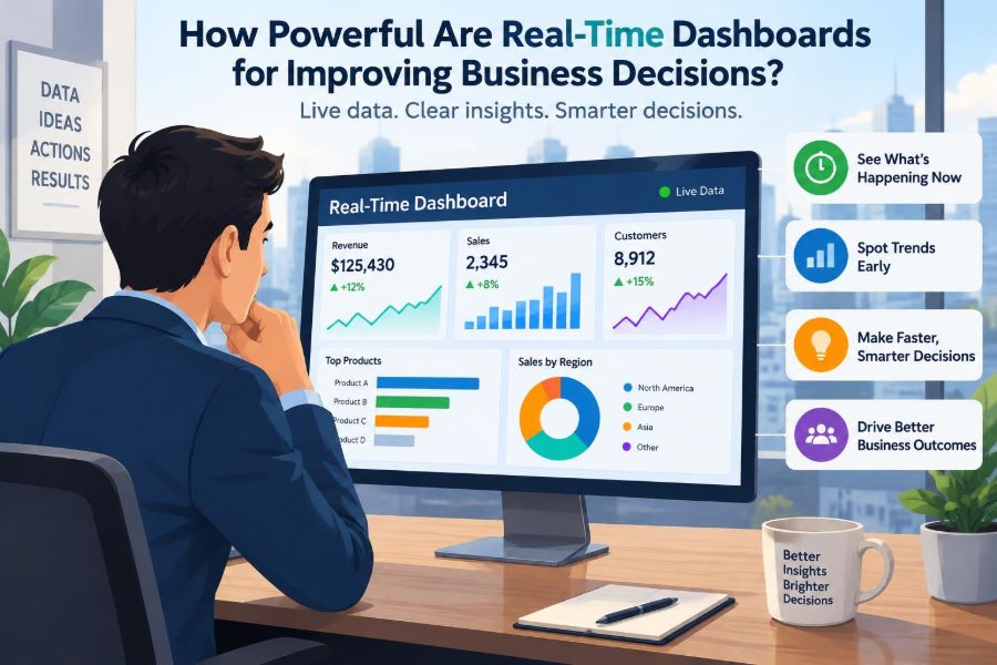
A real-time dashboard is a visual display of business measures that updates frequently as new data becomes available. Depending on the system, “real time” may mean seconds, minutes, or near-real-time updates at regular intervals.
It combines information from sources such as point-of-sale systems, websites, customer relationship management platforms, inventory software, support tools, or production equipment. Instead of searching through separate reports, users see selected measures in one place.
Real time does not necessarily mean instant. The useful standard is whether the information arrives quickly enough to influence the decision it is meant to support.
⏱️ Why Speed Changes the Decision Window
Many business decisions lose value as time passes. A retailer can respond to an unexpectedly popular product while stock remains available; a delayed response may mean lost sales and disappointed customers.
Dashboards make short decision windows visible. They help teams move from asking, “What happened last week?” to asking, “What is changing now, and what should we do next?”
That does not mean every decision should be immediate. Strategic choices, such as entering a new market, still need research and deliberation. Real-time visibility is most valuable where operational conditions can change quickly.
🔄 From Historical Reporting to Live Monitoring
Traditional reports are largely retrospective. They summarize completed periods, support reviews, and help leaders compare performance against plans. They remain essential for financial control, audits, and long-term analysis.
Live dashboards serve a different purpose: monitoring the present. They are particularly helpful when managers need to detect exceptions, coordinate a response, and observe whether an intervention is working.
| Tool | Main question | Typical use |
|---|---|---|
| Historical report | What happened? | Monthly review and trend analysis |
| Real-time dashboard | What is happening now? | Daily operations and exception response |
| Forecast model | What may happen next? | Planning demand, capacity, and budgets |
The strongest organizations use all three rather than treating one as a replacement for the others.
🎯 Decisions That Benefit Most From Live Data
Real-time dashboards are most powerful when a decision is frequent, time-sensitive, and connected to an action the business can take. They are less useful when the information changes rapidly but nobody has authority or capacity to respond.
- Managing stockouts, fulfilment delays, or production bottlenecks
- Responding to website failures, payment errors, or unusual traffic patterns
- Allocating customer support staff during demand spikes
- Monitoring campaign performance while budget can still be adjusted
- Identifying service-level problems in transport, hospitality, or healthcare operations
A useful test is simple: if the number moves, what would a person do differently today?
📈 Seeing Performance Before It Becomes a Result
Financial outcomes such as profit and quarterly revenue are often lagging indicators: they describe results after the underlying activity has occurred. A dashboard can also show leading indicators, which may signal what is likely to happen next.
For example, an online business may watch checkout failures, abandoned carts, delivery estimates, and customer complaints before these issues appear in revenue figures. A service firm may monitor new inquiries, response times, and project capacity before utilization falls.
Leading indicators are not predictions by themselves. They are early clues that deserve context and investigation.
🚨 Alerts Turn Observation Into Attention
A dashboard full of numbers still relies on someone noticing a meaningful change. Alerts can draw attention when a metric crosses a defined threshold, changes unusually quickly, or remains outside an acceptable range.
For example, a support manager might receive an alert if unresolved high-priority tickets rise beyond normal capacity. The alert does not diagnose the cause, but it can prompt the manager to inspect staffing, a product issue, or an outage.
Good alerts are specific and actionable. Too many alerts create noise, and employees quickly learn to ignore them.
🧩 A Dashboard Is a Decision System, Not a Screen
The display is only one part of the system. Real value comes from the sequence around it: reliable data, agreed measures, responsible owners, clear escalation rules, and a practical response.
Imagine a dashboard showing late deliveries. If no one knows whether logistics, procurement, or customer service owns the response, visibility merely makes the problem more visible. It does not make the business more capable.
Every critical metric should have an owner and an expected action path.
🗂️ Choosing Metrics That Match the Goal
Metrics should begin with a business objective, not with the data that happens to be easy to collect. A customer-service dashboard designed only around call volume may encourage speed while hiding whether customers actually received useful help.
Balanced measurement prevents this narrow view. A team could pair call volume with wait time, resolution rate, repeat contacts, and customer feedback. Each measure reveals a different part of performance.
Too many metrics weaken focus. A concise dashboard that answers a specific management question is generally more useful than a crowded catalogue of figures.
🧮 Defining Metrics Before People Debate Them
Terms that sound obvious can have different meanings. “Sales,” for instance, might mean orders placed, payments received, shipments completed, or revenue recognized under accounting rules.
Define each key metric in plain language: what it includes, what it excludes, when it updates, which system supplies it, and who is accountable for its accuracy. This is sometimes called a metric dictionary.
Clear definitions reduce unproductive meeting debates and make comparisons between teams more credible.
🧼 Data Quality Sets the Ceiling
A live dashboard can expose poor data faster than a weekly report, but it cannot repair the data on its own. Duplicate customer records, delayed system updates, missing transactions, and inconsistent product codes can all produce misleading conclusions.
Managers should build basic checks into the process. If a major measure suddenly changes, compare it with source systems and ask whether the change reflects business activity, a data pipeline issue, or a revised definition.
Fast inaccurate information is often more dangerous than slower verified information.
🔗 Integrating Data Without Creating Confusion
Businesses often store related information in separate systems. Sales may sit in a CRM platform, inventory in an enterprise system, and customer sentiment in a support tool. Integration can reveal useful connections, such as whether delivery delays are driving refund requests.
Yet combining data is not simply a technical exercise. Different systems may use different customer IDs, time zones, currencies, or update schedules. These differences must be reconciled before the combined view is trusted.
It is usually wiser to begin with a few high-value sources than to connect every available database at once.
👀 Designing for Scanability
Managers often glance at dashboards between meetings or during busy operational periods. Good design makes the most important condition clear in seconds: on track, at risk, or requiring action.
Use visual hierarchy. Put the most consequential measures first, show comparisons against a target or baseline, and use color sparingly to indicate status. A red figure without a benchmark provides little meaning.
Charts should fit the question. Trends work well as line charts; category comparisons often suit bars; tables are useful when exact detail matters.
🧠 Context Prevents Bad Interpretations
A rising number is not always good, and a falling number is not always bad. Higher website traffic may reflect a successful campaign, automated bot activity, or a confused audience repeatedly searching for help.
Context can include targets, prior periods, seasonal patterns, annotations, and filters by region, product, or customer group. A useful dashboard helps users ask better follow-up questions instead of declaring a verdict from one number.
For instance, a sudden drop in orders during a planned site maintenance window should be labelled so it is not mistaken for a demand collapse.
🔎 Drill-Down Finds the Story Behind the Signal
Summary measures identify where to look; detailed views help explain why. This movement from overview to detail is called drill-down.
A manager who sees an increase in returns may drill into product category, supplier, region, return reason, and order date. The result may reveal a packaging problem in one product line rather than a company-wide quality decline.
Drill-down should be purposeful. Endless filtering without a clear question can turn investigation into aimless data browsing.
🏪 Example: Managing Retail Inventory
Consider a hypothetical regional retailer preparing for a holiday weekend. A dashboard shows store-level sales, stock on hand, incoming deliveries, online reservations, and unusually high demand for selected products.
The operations team can transfer stock from slower-moving locations, update online availability, or delay a promotion that would worsen a shortage. These actions are possible because the information arrives before the selling opportunity ends.
However, the dashboard cannot decide whether moving stock is worthwhile. Staff time, transport cost, customer commitments, and expected demand still require managerial judgment.
💬 Example: Improving Customer Support Operations
A support dashboard might show incoming requests, queue length, first-response time, resolution time, reopened cases, and issue categories. During a product update, a sudden rise in one error category may indicate that customers need clearer guidance or that the product team should investigate a defect.
The best response is not always to push agents to close cases faster. If rapid closures increase reopened cases, the business may be optimizing a visible measure at the expense of customer outcomes.
Paired metrics make these trade-offs easier to see.
🏭 Example: Monitoring Production Flow
In a manufacturing setting, dashboards can show machine status, output, defects, work in progress, material availability, and downtime reasons. A bottleneck becomes easier to identify when downstream stations are waiting while one stage accumulates unfinished work.
Still, sensor readings and production counts require interpretation. A machine that appears idle may be undergoing planned maintenance, waiting for quality approval, or operating under a safety restriction.
Operational expertise gives live data meaning.
🤝 Creating a Shared Version of Events
When departments bring different spreadsheets to the same meeting, they can spend more time defending numbers than solving problems. A shared dashboard can establish a common operational picture.
This supports coordination across sales, finance, operations, and service. If everyone sees the same stock constraint, for example, sales can set customer expectations while operations prioritizes replenishment.
A shared view is not the same as universal access. Users should see the information necessary for their role, especially when data includes personal, financial, or commercially sensitive details.
⚖️ Balancing Central Visibility and Local Knowledge
Central leaders benefit from seeing patterns across the organization, but local teams understand circumstances that aggregate data may hide. A store manager may know that a local event, road closure, or staffing issue explains an unusual result.
The healthiest approach combines both perspectives. Central dashboards identify exceptions and comparisons; frontline teams add explanation and take appropriate local action.
This avoids two common errors: headquarters overreacting to a number without context, and local teams dismissing every uncomfortable signal as an exception.
🏃 Faster Decisions Can Also Mean Faster Mistakes
Speed is valuable only when paired with suitable controls. A short-term fluctuation can be random variation rather than a real change. Reacting to every movement may create unstable pricing, unnecessary stock transfers, or constant shifts in employee priorities.
Managers should distinguish between an isolated signal and a sustained pattern. Decision rules can help: investigate immediately when safety, security, or service thresholds are breached; observe longer when changes are small and reversible.
Where consequences are large, a dashboard should trigger review, not automatic action.
📉 The Danger of Vanity Metrics
Vanity metrics are numbers that look impressive but do not meaningfully guide decisions. Total social media followers, raw page views, or app downloads may attract attention while saying little about customer value or commercial performance.
A more useful metric connects activity to an objective. For example, rather than tracking only campaign impressions, a business might examine qualified inquiries, conversion paths, customer acquisition cost, or repeat purchasing behavior.
The question is not whether a metric is positive. It is whether a change in that metric should change a business decision.
🎮 Avoiding Metric Gaming
When targets are visible and closely monitored, people may improve the measure rather than the underlying outcome. A delivery team judged only on on-time completion could mark deliveries complete prematurely. A call center judged only on call duration could rush customers off the phone.
Use complementary measures, sample quality checks, and customer outcomes to reduce this risk. Just as importantly, discuss why a metric exists rather than treating it as a score to be beaten.
Dashboards influence behavior. Their design is therefore a management choice, not merely an analytics choice.
🔐 Privacy, Security, and Access Controls
Live data can contain employee performance details, customer contact information, payment signals, location data, or confidential commercial activity. Broad, casual access can create privacy, security, and ethical risks.
Organizations should apply role-based access, limit sensitive fields, keep records of significant access where appropriate, and follow applicable legal and contractual obligations. Requirements differ by jurisdiction and industry, so internal policy and specialist advice may be needed.
A useful dashboard provides enough detail to act without exposing information that the viewer does not need.
🛠️ Building a Dashboard Around a Workflow
Start with one recurring decision rather than an abstract wish to “be more data-driven.” Map the workflow: what event is being monitored, who notices it, what evidence they need, who can act, and how success is checked afterward.
- State the decision and the operational goal.
- Select a small set of measures that reveal progress and risk.
- Confirm data definitions, sources, and update frequency.
- Design the view for the person who will use it.
- Set alerts, ownership, and escalation expectations.
- Review whether actions taken actually improved outcomes.
This method keeps the technology connected to real work.
🧪 Pilot Before Scaling Across the Business
A pilot lets a team test whether a dashboard is understandable, reliable, and genuinely useful under normal working pressure. Choose a process with a clear problem, available data, and people willing to give practical feedback.
During the pilot, observe behavior rather than only collecting opinions. Do managers open the dashboard at decision points? Do alerts lead to sensible action? Do users keep returning to separate spreadsheets because a key detail is missing?
Refine the design before extending it to other teams. Scaling a confusing dashboard only spreads confusion faster.
📚 Training Users to Ask Better Questions
Data literacy is the ability to read, question, and communicate with data. It does not require every manager to become a statistician, but it does require basic habits.
- Compare a result with an appropriate benchmark.
- Ask whether the data is complete and current.
- Separate correlation from causation.
- Look for segments that may be hidden by averages.
- Consider what action is proportionate to the evidence.
Training should also make it acceptable to challenge a dashboard. Confidence in data grows through transparent questioning, not blind acceptance.
🧱 Knowing When Real Time Is Unnecessary
Not every metric deserves constant monitoring. Monthly employee development progress, annual supplier assessments, and long-range market positioning may be better reviewed on a slower cadence.
Real-time reporting can create pressure to act on changes that are not meaningful at short intervals. It may also consume technical resources and attention that would be better spent on data quality or deeper analysis.
Choose the update frequency that matches the pace of the underlying process and the decision being made.
🌱 Measuring Whether the Dashboard Adds Value
Dashboard success is not the number of logins, charts, or data connections. It is whether the tool improves a real business process.
Look for practical evidence: faster detection of exceptions, fewer avoidable handoffs, more consistent decisions, reduced time spent compiling reports, or better service recovery. Be cautious about claiming that a dashboard alone caused an outcome, because process changes, training, and market conditions may also matter.
Regular review keeps dashboards relevant as goals, systems, and responsibilities change.
🧭 The Core Principle: Insight Must Lead to Responsible Action
Real-time dashboards are powerful because they compress the time between business activity and managerial awareness. They can expose a problem while options still exist, align teams around a common view, and make operational decisions more responsive.
But they are not substitutes for sound strategy, trustworthy data, human expertise, or thoughtful governance. A dashboard points to where attention is needed; people must determine why the change occurred and what response is justified.
The most effective dashboards are therefore focused, accurate, contextual, secure, and embedded in clear workflows. They help people act sooner without encouraging them to act carelessly.
A real-time dashboard improves business decisions not by making every answer immediate, but by making the right questions visible when action can still make a difference. 📊🧭