
A small business owner may know last month felt busy, yet still struggle to answer a basic question: did the business actually improve? Sales activity, customer messages, invoices, deliveries, and costs can fill every day without producing a clear picture.
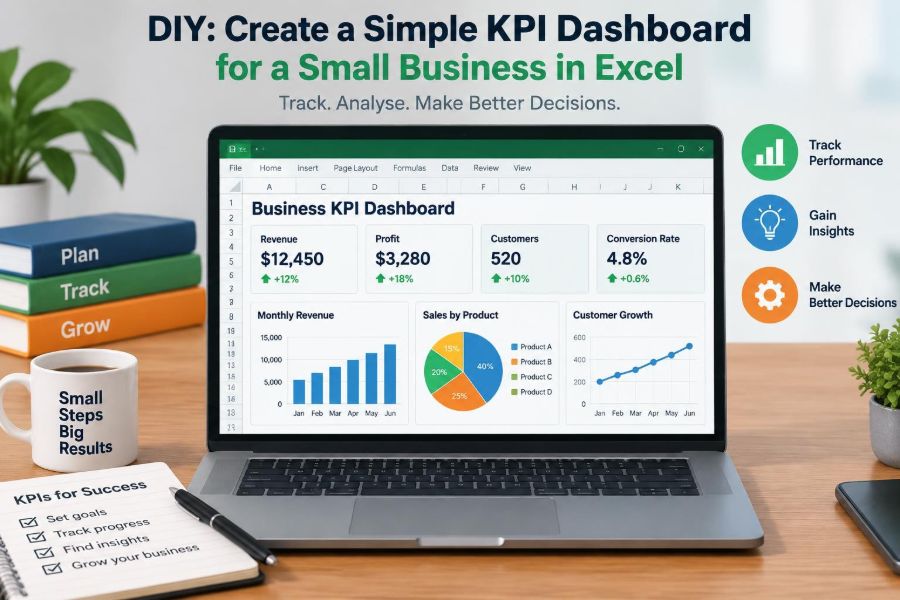
That is where a KPI dashboard helps. Instead of searching through receipts, exports, and separate spreadsheets, it puts a small set of decision-relevant measures in one place.
You do not need specialist software to begin. Excel can turn ordinary business records into a useful monthly management view—provided the dashboard is built around decisions rather than decoration.
This guide shows how to design a practical, simple dashboard for a small business, from choosing measures to creating formulas, charts, and a review routine.
🧭 Start with the decision, not the spreadsheet
A key performance indicator, or KPI, is a measure that shows whether an important business objective is moving in the right direction. It is not simply any number that happens to be available.
Begin by asking what decisions you need to make. A café owner may need to decide whether staffing matches demand. A service firm may need to decide which lead sources deserve attention. A retailer may need to decide whether stock is tying up too much cash.
When the decision is clear, the useful measure becomes easier to identify. A dashboard should reduce uncertainty, not create another reporting task.
🎯 Define what success means this quarter
Choose a short planning period, often the next three months, and write two to four outcomes in plain language. Examples include increasing profitable sales, improving repeat purchases, reducing overdue invoices, or shortening delivery delays.
Each outcome should have an owner and a practical meaning. “Grow the business” is too broad; “increase monthly sales from existing customers while protecting margin” gives the team something concrete to manage.
Targets are planning assumptions, not predictions. Review them when pricing, capacity, seasonality, or market conditions change.
🔍 Separate KPIs from supporting metrics
A dashboard can contain supporting detail, but its headline figures should remain few. KPIs tell you whether to investigate or act; supporting metrics help explain why.
| Level | Example | Purpose |
|---|---|---|
| KPI | Monthly gross profit | Shows whether the core activity is producing profit before overheads. |
| Supporting metric | Average discount rate | May explain a fall in gross profit. |
| Operational measure | Orders packed today | Helps run daily work but may not belong on the monthly dashboard. |
A useful rule is to keep the main page to roughly five to eight headline KPIs. More can be tracked in source sheets or a second detail view.
🧱 Choose a balanced set of measures
Revenue alone can hide serious problems. A business can sell more while margins shrink, invoices remain unpaid, or customers fail to return.
A balanced dashboard usually combines measures from several areas:
- Financial: sales, gross profit, operating costs, cash collected.
- Customers: new customers, repeat customers, conversion rate, complaints.
- Operations: on-time delivery, jobs completed, stock availability.
- Sales pipeline: enquiries, quotations, win rate, future booked work.
Select only categories that reflect the business model. A solo consultant does not need inventory measures; a shop with physical products probably does.
💵 Build the sales data table first
Create a worksheet called Sales_Data. Put one transaction, invoice, order, or completed job on each row. Avoid manually typed monthly totals because they cannot be reliably filtered, checked, or reused.
Useful columns include date, invoice number, customer, product or service, sales channel, quantity, sales amount, direct cost, payment status, and salesperson where relevant.
Convert the range to an Excel Table using Ctrl+T. Give it a clear name such as tblSales. Tables expand as new rows are added and make formulas easier to read.
🧾 Keep source data tidy and consistent
Good dashboards depend more on consistent data than on sophisticated formulas. Use real Excel dates, not dates stored as text. Use one spelling for each sales channel and customer where possible.
Do not merge cells inside a data table, insert blank subtotal rows, or mix notes with transactions. These habits make sorting, filtering, and PivotTables unreliable.
If source data comes from accounting software or a point-of-sale system, export it consistently. Keep the original export in a separate sheet or file so corrections can be traced.
📅 Add a reporting-period helper column
Dashboards often compare months, quarters, or years. A helper column makes this much simpler. In a sales table, a month-start date can be created with:
=DATE(YEAR([@Date]),MONTH([@Date]),1)Format the result as mmm yyyy. Because it remains a real date, Excel sorts January through December correctly rather than alphabetically.
You can add a year column, quarter column, or week-ending date in the same way. Choose the period that matches how managers actually review performance.
➕ Calculate revenue clearly
Revenue is usually the sales value before costs. If an invoice can contain multiple items, use line-level data and sum the sales amount. If you track completed jobs, define whether revenue is counted when work is delivered, invoiced, or paid.
That definition matters. A cash-based view answers “what money arrived?” while an invoiced-sales view answers “what work did we bill?” Both may be useful, but they should never be confused.
For a selected month in cell B2, this formula totals invoice values in a table:
=SUMIFS(tblSales[Sales Amount],tblSales[Month],$B$2)📉 Calculate gross profit and margin
Gross profit is revenue minus direct costs: costs directly associated with providing a product or service, such as materials, wholesale inventory, or subcontractor charges for a job.
Add a calculated table column:
=[@[Sales Amount]]-[@[Direct Cost]]Gross margin shows the proportion of sales remaining after direct costs:
=IFERROR(Gross_Profit/Revenue,0)Format margin as a percentage. A rising revenue figure alongside a falling gross margin is a prompt to examine pricing, discounts, supplier costs, product mix, or data quality.
🏦 Treat cash as a separate management question
Profit and cash are related but different. A profitable sale that has not been paid may improve reported profit without helping the bank balance this week.
If cash collection matters, maintain a receipts table with received date, customer, amount, and related invoice. Your dashboard can then show cash received in the month, overdue invoice value, or the percentage of invoices paid by their due date.
Do not try to make a simple dashboard replace a full cash-flow forecast. It can highlight pressure points, while a forward-looking forecast requires expected payment and expense dates.
👥 Measure customer activity without overcomplicating it
For many small businesses, customer counts are more actionable than social-media attention. Track new customers, returning customers, average order value, or repeat-purchase rate when your data makes these meaningful.
For example, average order value is:
=IFERROR(Total_Revenue/Number_of_Orders,0)Interpret it carefully. A higher average can result from successful upselling, but it can also occur because low-value customers stopped buying. Pair it with order count and customer feedback before drawing conclusions.
📣 Connect marketing activity to outcomes
Marketing measures should follow the path from attention to commercial result. For a business that receives enquiries, that could mean leads, qualified leads, quotations sent, orders won, and revenue won.
Conversion rate is commonly calculated as:
=IFERROR(Orders_Won/Qualified_Leads,0)Define each stage before reporting it. A “lead” could mean a web form, a phone call, or a person who has requested a proposal. Changing the definition midway makes comparisons misleading.
⚙️ Include one or two operational signals
Operational indicators reveal whether the business can deliver what it sells. A repair company might track jobs completed on time; an online retailer might track orders dispatched within its promised window.
A simple on-time rate is the number completed on time divided by total completed. This is useful only if “on time” is consistently recorded against a promised date.
Use operational KPIs to identify constraints. Strong demand is not automatically good news if service delays generate refunds, rework, or lost repeat business.
🗂️ Create a sensible workbook structure
Keep raw data, calculations, and the visual dashboard separate. A clean structure reduces accidental edits and lets others understand the workbook quickly.
- Dashboard: selected period, KPI cards, charts, and action notes.
- Sales_Data: transaction-level sales and direct cost data.
- Other_Data: leads, operations, or cash receipts if required.
- Calculations: monthly summaries, targets, and chart-ready tables.
- Definitions: KPI formulas, data source, owner, and refresh instructions.
For a very small business, some sheets can be combined. The principle is separation of purpose, not unnecessary complexity.
🧮 Use formulas where they add transparency
SUMIFS and COUNTIFS are excellent for straightforward, auditable summaries. They calculate totals based on multiple conditions without requiring advanced Excel skills.
For example, count paid invoices in the selected month:
=COUNTIFS(tblSales[Month],$B$2,tblSales[Payment Status],"Paid")Use IFERROR around ratios where the denominator could be zero. It prevents distracting error messages, but do not use it to hide missing source data that should be investigated.
🧩 Use PivotTables for flexible summaries
A PivotTable groups and totals large tables quickly. It is particularly useful for revenue by month, sales by channel, profit by product category, or customer purchases over time.
Insert a PivotTable from the source Table, place Month in Rows, and Sales Amount in Values. Add Channel as a filter or column field. This produces a summary that can also feed a PivotChart.
PivotTables need refreshing after data changes. Right-click and choose Refresh, or use Data Refresh All before every review. A dashboard showing last month’s data by accident is worse than no dashboard.
🎛️ Make the reporting period easy to change
Put a clearly labelled selected month or quarter near the top of the Dashboard sheet. Use data validation to create a dropdown from a list of valid period dates.
Link formulas and chart data to that selection. The reader should be able to switch periods without editing multiple formulas or hunting through filters.
If you use PivotTables, a timeline or slicer can provide an intuitive alternative. Test it carefully: all relevant pivots must share the correct data source and connections.
🧷 Design KPI cards that answer one question
A KPI card is a compact display of one measure: its current value, target or comparison, and a short label. Examples are “Revenue this month,” “Gross margin,” and “Overdue invoices.”
Place the value prominently, then add context beneath it: “Target,” “vs. prior month,” or “vs. same month last year.” A number without a benchmark is difficult to interpret.
Use the same units consistently. Show currency with appropriate rounding, percentages with a sensible number of decimals, and counts as whole numbers.
📈 Pick charts that reveal a pattern
Charts should make comparison faster, not make the dashboard more colourful. A line chart is usually best for a monthly trend. A bar chart works well for comparing channels, products, or locations.
Avoid pie charts with many categories and avoid 3D effects. They make proportions and differences harder to judge. If categories are numerous, show the leading few and group the remainder as “Other” only when that does not conceal a meaningful issue.
Give each chart a question-based title, such as “Is monthly revenue rising?” rather than a generic title like “Sales Chart.”
🎨 Use colour as a signal, not decoration
Use a restrained palette. One neutral colour for most values, one accent colour for focus, and limited warning colours are usually enough. Excessive colour competes for attention.
Conditional formatting can flag a KPI below target or an overdue amount above a chosen threshold. Pair colour with text or icons where possible; colour alone is not clear for every reader.
Red does not always mean failure. A lower stock level may be desirable if it reflects reduced waste, while a higher level may be necessary before a seasonal rush. Set rules that match the operational reality.
🧪 Check the numbers before trusting the dashboard
Validation is a management habit, not a one-time setup task. Reconcile a dashboard total against a source report or a manually checked sample, especially after changing formulas or importing a new export.
Test edge cases: a month with no sales, a refund, a blank direct cost, an invoice dated at year end, and a customer name entered differently. These cases often expose weak assumptions.
Add a small data-quality check, such as a count of blank dates or unclassified sales channels. It makes missing information visible instead of silently excluding it.
🧠 Add comparison, context, and commentary
Every headline KPI needs a reference point. Compare with target, prior month, prior quarter, budget, or the equivalent period last year. The appropriate comparison depends on seasonality and the maturity of the business.
Include a short notes area for unusual events. A sales drop may reflect a supplier delay, planned closure, or an intentional shift away from low-margin work. Context prevents people from treating every variance as a performance failure.
A helpful review question is: “What changed, why did it change, and what will we do next?”
🚫 Avoid vanity metrics and false precision
Vanity metrics look impressive but do not reliably guide action. A large follower count may matter less than the number of enquiries that become profitable customers.
Likewise, a percentage displayed to two decimal places can suggest accuracy the underlying data does not possess. Round numbers in the dashboard, while keeping reasonable precision in source calculations.
Choose a measure because it changes a decision, not because it is easy to count.
⚠️ Watch for common dashboard mistakes
Several patterns make otherwise attractive dashboards unhelpful:
- Tracking only revenue and ignoring profit, cash, or delivery capacity.
- Combining different definitions of sales in the same chart.
- Using manual copy-and-paste figures that cannot be traced.
- Comparing a partial month with a full month without a clear label.
- Setting targets with no owner or planned response.
- Filling the page with charts that repeat the same information.
The remedy is usually simpler design, clearer definitions, and a repeatable update process—not more formulas.
🔒 Protect the workbook without making it inaccessible
Limit edits to raw data and formula areas where appropriate. Excel sheet protection can reduce accidental overwriting, but it is not a complete security system for sensitive information.
Store the file in an approved shared location with sensible access permissions. Be cautious about including personal customer details if the dashboard will be broadly circulated. Often, summary information is all decision-makers need.
Keep a dated backup or version history, especially before major structural changes.
🔄 Establish a monthly refresh routine
A dashboard becomes useful through repetition. Choose a consistent cycle: import or enter data, check data quality, refresh PivotTables, review exceptions, add commentary, and discuss actions.
- Close or update the reporting period’s transactions.
- Check blanks, duplicates, and unusual values.
- Refresh formulas, PivotTables, and charts.
- Compare results with target and prior periods.
- Record decisions, owners, and deadlines.
For a rapidly changing business, a brief weekly operational check can complement a fuller monthly review.
🗣️ Turn the review into a management conversation
The dashboard is a starting point, not the meeting itself. Ask which result needs explanation, what evidence supports that explanation, and what small action can be tested before the next review.
For example, if gross margin falls, the response might be to examine the largest discounted orders, request supplier prices, or revise a quotation process. “Improve margin” is not an action; “review discounts above a defined level before approval” is closer to one.
Assign each action to a named person and revisit it. Otherwise, dashboards can become passive scoreboards.
🌱 Start simple and improve through use
Your first version does not need automation, complex models, or every department’s data. Start with reliable sales, direct costs, cash collection, and one operational measure that affects customer experience.
After two or three reporting cycles, remove measures nobody uses and add detail only where recurring questions appear. If leaders repeatedly ask about sales by channel, that is evidence for a channel view; if nobody discusses a chart, it may not earn its space.
As the business grows, Excel may eventually be supplemented by accounting, CRM, inventory, or business-intelligence tools. The KPI definitions and review habits you build now will still matter.
✅ The core principle: make performance actionable
A simple Excel KPI dashboard succeeds when it connects trustworthy data to a small number of decisions. It should show performance, provide enough context to interpret it, and point the team toward a next action.
Build from clean tables, define each measure consistently, balance financial and operational signals, and review results on a dependable schedule. Attractive formatting is useful only after those foundations are in place.
The best dashboard is not the one with the most metrics; it is the one that helps a small business notice what matters and act before small issues become expensive habits. 📊💡