
It is Monday morning, and a sales manager has three different answers to a simple question: how did we perform last week? One comes from a spreadsheet, another from the finance system, and a third from a team update. Each answer may be reasonable, but none creates confidence.
A business dashboard is meant to change that experience. It brings selected information into one usable view so managers can move from searching for numbers to discussing what those numbers mean.
Yet dashboards do not automatically create good decisions. A colourful screen can hide flawed data, encourage rushed conclusions, or overwhelm people with measures that have no connection to their real choices.
Understanding what happens “under the hood” helps students, analysts, and managers use dashboards as decision tools rather than as digital decoration.
🧭 A Dashboard Is a Decision Interface
A business dashboard is a visual display of selected performance information, usually drawn from one or more operational systems. It may show sales, costs, customer activity, staffing, production, cash flow, or project delivery.
Its real job is not to display every available fact. It is to help a person notice what needs attention, investigate likely reasons, and choose an appropriate response.
Think of it like a vehicle dashboard. A driver does not need a diagram of every engine component while driving. They need clear signals about speed, fuel, temperature, and warnings that might change what they do next.
🗃️ Raw Data Starts as Business Activity
Every dashboard begins with events recorded during normal work. An online order is placed, an invoice is issued, an employee clocks in, a support ticket is resolved, or a machine completes a production run.
These records are raw data: individual observations before they have been cleaned, combined, or interpreted. A single order record might include a date, product, quantity, customer, sales channel, discount, delivery status, and payment value.
Raw data is detailed and useful, but it is rarely ready for a management meeting. Managers usually need a pattern or comparison, not thousands of separate transaction lines.
🔌 Source Systems Hold Different Pieces of the Story
Most organisations do not keep all information in one place. Sales may be recorded in a customer relationship management system, inventory in an enterprise resource planning system, web behaviour in an analytics platform, and payroll in an HR system.
This separation reflects how work is organised, but it creates a challenge: the same customer, product, or date may be described differently across systems. A dashboard must connect these pieces carefully before presenting a single business view.
For example, a retail manager looking at falling sales may need inventory data to see whether products were unavailable, marketing data to see whether demand fell, and returns data to see whether quality concerns increased.
🧹 Cleaning Data Prevents Misleading Signals
Before data can support decisions, it often needs cleaning. This means correcting or flagging obvious errors, removing duplicate records, handling missing values, and standardising formats.
A date written as 03/04 can mean different things in different systems. “North Region,” “N. Region,” and “North” may all refer to the same area. Unless those differences are resolved, totals and comparisons can be wrong.
Cleaning does not mean quietly changing inconvenient results. Good practice preserves the original record, documents the transformation, and makes exceptions visible to the people responsible for data quality.
🔗 Integration Creates a Shared Business View
Data integration is the process of bringing data from different sources into a consistent structure. It may happen in a data warehouse, a cloud platform, or a simpler reporting model, depending on the organisation.
Integration commonly requires matching identifiers. If a customer is called “Greenfield Ltd” in one system and uses account number 10482 in another, the model needs a reliable way to recognise them as the same entity.
Without this work, a dashboard can appear complete while combining incompatible records. The visual layer is only as trustworthy as the relationships underneath it.
🧮 Definitions Turn Fields into Measures
A dashboard does not simply add numbers together. It applies business definitions to create measures such as revenue, gross margin, customer retention, on-time delivery, or average order value.
Definitions matter because ordinary words can hide different calculations. “Sales” might mean orders placed, invoices issued, cash received, or revenue recognised after returns. Each can be useful, but they answer different questions.
Strong dashboards make key definitions available to users. When a manager asks why their result differs from finance’s report, the first step should be checking the measure definition rather than debating the chart.
📐 Metrics Need a Formula and a Purpose
A metric is a measurable value used to monitor some aspect of performance. A useful metric has a clear formula, a defined owner, a refresh schedule, and a reason for being watched.
For instance, a customer support team might track first-response time. The formula should specify when the clock starts, which cases count, whether automated replies are excluded, and whether the result is an average or a median.
If those choices are vague, teams may use the same label while making decisions from different calculations.
🎯 KPIs Connect Measurement to Strategic Priorities
A key performance indicator, or KPI, is not just any metric. It is a measure selected because it reflects a priority that management is actively trying to improve or protect.
A business can measure hundreds of things, but a leadership team cannot focus seriously on hundreds at once. If a company’s immediate goal is profitable growth, revenue, margin, customer acquisition cost, and repeat purchasing may deserve more attention than less consequential activity counts.
A KPI should have an intended decision behind it: if this moves in an unfavourable direction, who needs to respond and what options do they have?
⚖️ Leading and Lagging Indicators Serve Different Jobs
Lagging indicators describe results that have already occurred. Monthly profit, completed sales, and employee turnover are common examples. They are essential for accountability but may arrive too late to prevent a problem.
Leading indicators provide earlier evidence about conditions likely to influence future results. Qualified sales opportunities, stock availability, staff training completion, or unresolved high-priority defects can sometimes offer advance warning.
Leading does not mean certain. A rising number of sales leads does not guarantee revenue. It means the measure may help managers intervene before the final outcome is fixed.
| Indicator type | Example | Typical management use |
|---|---|---|
| Lagging | Quarterly customer churn | Assess the outcome and accountability |
| Leading | Declining product usage among new customers | Target onboarding or support before cancellation |
🕒 Time Windows Change the Meaning of Performance
Every figure belongs to a period. Daily results can reveal operational disruptions, weekly results can support team management, and monthly or quarterly views often suit financial planning.
Short periods are more responsive but also more volatile. A one-day dip in website orders may reflect a technical interruption, a holiday, or ordinary variation. A manager should resist treating every movement as a lasting trend.
Dashboards become more useful when they show a sensible comparison: against the previous period, the same period last year, a plan, or a target. The correct comparison depends on seasonality and the decision being made.
🧩 Aggregation Makes Large Data Readable
Aggregation means summarising detailed records into totals, averages, counts, rates, or other grouped measures. It allows thousands of transactions to become a weekly sales figure or a customer satisfaction trend.
However, a total can conceal important differences. Overall revenue might be stable while one region is growing, another is declining, and a third is generating unprofitable sales through heavy discounting.
Good dashboards let users move from summary to detail when needed. This is often called drill-down: starting with a headline result, then examining region, product, customer segment, or transaction-level evidence.
📊 Visual Choice Shapes What People Notice
Charts are not interchangeable. A line chart is usually effective for trends over time, while bars are often clearer for comparing categories. A table is useful when exact values matter, especially for operational follow-up.
A pie chart may communicate a small number of simple shares, but it becomes difficult to read when slices are numerous or similar in size. Decorative gauges can consume space without showing enough context.
The design question is practical: what comparison should the viewer make, and which visual form makes that comparison easiest?
🚦 Status Colours Need Clear Rules
Green, amber, and red indicators can help users scan priorities quickly. But colour only communicates reliably when the thresholds behind it are explicit and sensible.
Suppose on-time delivery is coloured red below a target. Is the target based on customer promise dates, internal service standards, or an annual plan? Is a small change meaningful, or within normal variation? These decisions should not be arbitrary.
Colour should also not be the only signal. Labels, values, icons, and accessible contrast help people who cannot distinguish colours easily or who are viewing a dashboard in poor conditions.
🔍 Filters Answer a Specific Management Question
Filters allow users to narrow a view by period, geography, product line, business unit, customer segment, or other dimension. Used well, they turn a general report into a relevant management tool.
For example, a national operations director may first see delivery performance overall, then filter to a particular depot and service type after spotting a decline. This supports investigation without forcing every audience to use a separate dashboard.
Too many filters create confusion. Prioritise dimensions that match real decisions, and make the currently selected filters obvious so users do not misread a subset as a company-wide total.
🧠 Context Turns a Number into Insight
A number alone rarely tells a manager what to do. “Returns increased” becomes more useful when the dashboard shows the size of the change, the products involved, the time pattern, the return reasons, and the comparison baseline.
Context also includes operational knowledge that may not be in the data. A warehouse relocation, pricing change, supplier disruption, or marketing campaign can explain a movement that would otherwise appear mysterious.
Dashboards should begin the conversation, not end it. Managers need to combine quantitative evidence with informed questions and frontline knowledge.
🧪 Correlation Is Not a Cause
When two measures move together, it is tempting to assume one caused the other. A dashboard may show that sales fell when customer service response times increased, but both may have been affected by a product issue or unusually high demand.
Managers should treat patterns as hypotheses. Check timing, segment the data, look for alternative explanations, and speak with people close to the work before committing resources.
This discipline matters especially when dashboards include automated alerts. An alert identifies an unusual condition; it does not prove why that condition exists.
🗺️ A Hypothetical Example: Diagnosing a Sales Dip
Imagine a manager sees that weekly revenue has declined. The headline chart is the signal, not the diagnosis. A drill-down shows that the decline is concentrated in one product category and one region.
Inventory data then reveals lower availability for that category. Further checking shows a supplier delivery was delayed. The appropriate decision may be to reallocate stock, communicate realistic availability, and adjust promotion plans—not immediately blame the regional sales team.
This example illustrates a useful sequence: detect, investigate, validate, decide, and monitor the effect of the response.
🔔 Alerts Should Direct Attention, Not Create Panic
Alerts notify users when a measure crosses a threshold or changes unusually. They are valuable when managers cannot watch a dashboard continuously, such as when cash collections are delayed or service levels fall sharply.
Badly designed alerts create noise. If people receive warnings for routine fluctuations, they learn to ignore them. If thresholds are too loose, important changes may go unnoticed.
Each alert should answer three questions: what happened, who should review it, and what first check should they make? An alert without a response path is merely a louder dashboard.
🔄 Refresh Timing Determines Operational Value
Some decisions require near-real-time data, while others do not. A call-centre supervisor may need current queue information; a board reviewing strategic performance may need validated monthly figures.
Faster refreshes can improve responsiveness, but they also increase technical complexity and may show incomplete or unverified records. A dashboard should state when it was last refreshed and, where relevant, whether data is preliminary.
Managers should match data freshness to decision urgency rather than assuming that the newest number is always the best one.
🛡️ Governance Protects Trust in the Dashboard
Data governance is the set of responsibilities, rules, and controls used to manage data properly. It includes defining who owns a metric, who may change a calculation, how errors are corrected, and how sensitive information is protected.
A dashboard loses credibility quickly when numbers change without explanation or departments maintain competing versions of the same KPI. Governance creates a controlled process for resolving those issues.
It should be practical rather than bureaucratic. Users need a clear route for reporting a problem and an accountable person who can explain the measure.
🔐 Access Controls Balance Usefulness and Privacy
Dashboards can combine commercially sensitive, personal, or confidential information. Access should follow the principle that people receive the information needed for their role, rather than unrestricted access by default.
A regional manager may need to see performance for their area but not individual compensation data across the company. A customer-service dashboard may require anonymised or limited fields where detailed personal data is unnecessary.
Permissions, secure handling, and careful sharing are management responsibilities, not merely technical settings.
👥 Different Audiences Need Different Views
Executives often need a concise view of strategic outcomes, risks, and major exceptions. Department managers need enough detail to allocate people and solve operational problems. Frontline teams may need immediate workload and quality measures.
Trying to serve all audiences with one screen often produces clutter. A well-designed dashboard ecosystem can use a shared data model while offering role-appropriate views.
Consistency still matters. If different groups see different versions of revenue or customer count, the distinction must be intentional and clearly explained.
🗣️ The Management Meeting Is Where Data Becomes Action
A dashboard has greatest value when it improves the quality of management conversations. A productive review meeting moves beyond reading figures aloud and asks what changed, why it changed, what response is appropriate, and who owns the next step.
Teams can use a simple agenda:
- Review material exceptions and trends.
- Separate evidence from assumptions.
- Agree actions, owners, and deadlines.
- Return to the measures later to assess whether the action worked.
This makes the dashboard part of a learning cycle rather than a monthly ritual.
⚠️ Common Mistake: Measuring What Is Easy
Organisations often track what systems already produce rather than what decisions require. Website visits, calls handled, emails sent, and meetings attended may be easy to count, but activity is not necessarily value.
Activity measures can still be useful diagnostic information. The mistake is treating them as proof of progress without linking them to outcomes such as customer value, quality, cost, risk, or strategic capability.
Before adding a measure, ask: if this changes, what decision would we make differently?
📈 Common Mistake: Rewarding the Metric Instead of the Goal
When a metric becomes a target, people may optimise the number in ways that damage the underlying purpose. A team rewarded only for short call times might rush customers off the phone, creating repeat contacts and weaker service.
This does not mean targets are useless. It means measures need balance. Combine speed with quality, volume with margin, or output with safety and customer outcomes where those trade-offs exist.
Managers should also watch for sudden improvements that deserve explanation, especially when incentives have changed.
🧱 Common Mistake: Treating a Dashboard as Finished
A dashboard is a product that needs review. Business priorities change, source systems change, and users discover that some measures create confusion while others are missing.
Useful feedback is specific: which decision was difficult, what evidence was unavailable, which definition was unclear, and which visual took too long to interpret. This is more helpful than simply requesting “more data.”
Regular refinement keeps the dashboard aligned with real management work.
🛠️ Building a Dashboard Begins with Decisions
The strongest implementation process starts with decision mapping, not with chart selection. Interview intended users about recurring decisions, the questions they ask, the time available, and the consequences of getting the decision wrong.
Then identify the smallest set of measures that supports those decisions. Confirm definitions with finance, operations, and other relevant owners before building extensive visualisations.
A practical sequence is:
- Define audience, decisions, and success criteria.
- Assess source quality and ownership.
- Agree metric definitions and comparison periods.
- Prototype a focused view with real users.
- Test data, permissions, refreshes, and exceptions.
- Launch, train users, and improve from observed use.
📚 Data Literacy Makes the Tool More Valuable
Users do not need to become data scientists to use dashboards well. They do need basic data literacy: understanding definitions, reading charts, recognising uncertainty, checking filters, and distinguishing a trend from a one-off movement.
Managers can build this capability by asking consistent questions. What is the source? What period does this cover? Compared with what? Is this a result, a warning sign, or an explanation? What evidence would change our conclusion?
These habits reduce both blind trust and unproductive scepticism.
🤖 Automation Can Accelerate Analysis, Not Replace Judgement
Modern dashboard tools can automate refreshes, flag anomalies, generate summaries, and suggest patterns. These features can reduce manual effort and help teams notice issues faster.
They still depend on data quality, sound definitions, and human review. An automated explanation may miss local circumstances, confuse association with cause, or reflect bias in the underlying data.
Use automation to focus attention and speed routine work. Keep accountability for decisions with people who understand the business context and consequences.
🏁 The Core Principle: From Numbers to Responsible Action
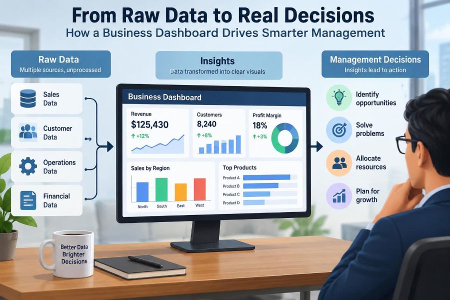
A useful dashboard follows a chain: reliable business activity is captured as data; data is cleaned and integrated; agreed definitions create meaningful measures; visuals reveal relevant patterns; managers investigate context and act.
Breaks anywhere in that chain weaken the final decision. Attractive charts cannot repair unreliable source records, and precise metrics cannot substitute for thoughtful judgement.
The best dashboards are therefore not the busiest or most visually dramatic. They are trusted, focused, understandable, and embedded in a management routine that turns evidence into accountable action.
A business dashboard earns its value when it helps people make a better decision at the moment that decision can still make a difference. 📊🧭✅