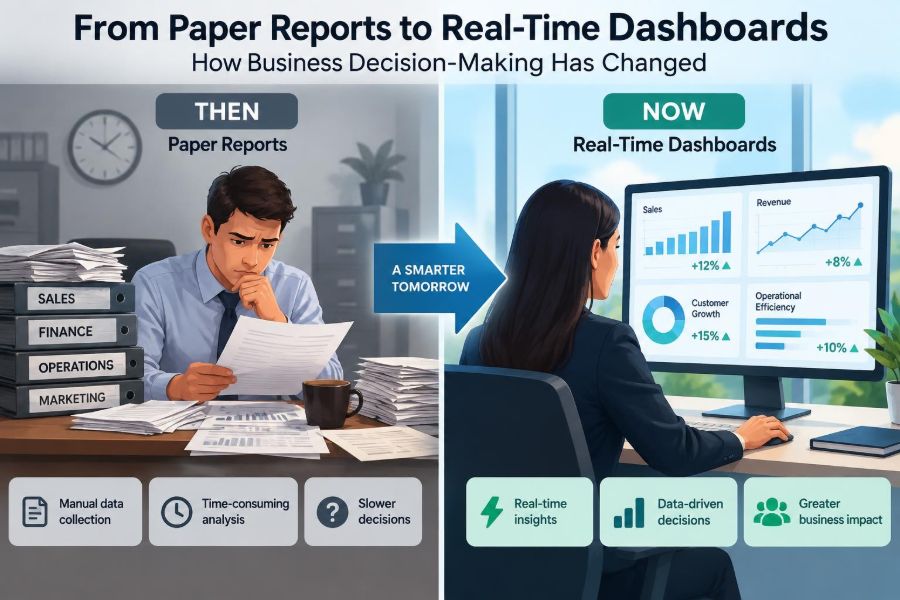

A store manager notices that a best-selling item has disappeared from the shelves. A week ago, the monthly inventory report showed healthy stock. By the time the report is discussed, customers have already left empty-handed, staff are improvising substitutes, and the supplier needs several days to respond.
For much of business history, this was normal. Leaders made decisions from reports that summarized what had already happened, often after the relevant moment had passed. The reports were useful, but their slow rhythm shaped the organization around delayed visibility.
Now the same manager may open a dashboard and see stock levels, incoming deliveries, online orders, and sales by hour. That does not automatically produce a good decision. It does, however, change what leaders can notice, question, and act on.
The move from paper reports to real-time dashboards is not simply a change in presentation. It has altered the speed, structure, responsibility, and risks of business decision-making.
📜 The paper-report era
Paper reports turned scattered transactions into a manageable record. Sales ledgers, budget packs, production summaries, and meeting binders gave managers a common basis for discussion when information could not be viewed instantly.
They also imposed a natural delay. Data had to be collected, checked, typed, printed, distributed, and interpreted. A weekly or monthly report therefore described a completed period rather than the organization’s current condition.
This system was not inherently poor. For long-term planning, annual budgets, audited accounts, and stable operations, periodic reporting remains valuable. Its main limitation was that fast-moving problems could develop between reporting cycles.
⏳ Why reporting cycles shaped decisions
When information arrives monthly, management naturally learns to make monthly decisions. Teams compare the latest period with the previous one, explain major variances, and agree on actions for the next review.
This cadence encouraged deliberation and documentation. It could also make organizations reactive. A production defect, a sudden demand shift, or an unpaid invoice might be visible internally before it appeared in the formal report, yet not receive coordinated attention until later.
The reporting cycle was therefore more than an administrative schedule. It determined when a problem became officially visible and who was expected to respond.
🖥️ What a real-time dashboard actually is
A dashboard is a visual interface that brings selected measures into one place. A real-time dashboard updates frequently enough to support immediate operational decisions, although real time does not always mean every second.
For a delivery company, updates every few minutes may be useful. For a financial planning team, a daily refresh may be entirely appropriate. The right frequency depends on how quickly conditions change and how quickly the business can take meaningful action.
Dashboards are often fed by operational systems such as point-of-sale software, customer relationship management systems, production equipment, web analytics, and accounting platforms. They are decision tools, not merely attractive charts.
🔄 From snapshots to continuous signals
A traditional report is a snapshot: it captures performance at a defined point or period. A dashboard is closer to a stream of signals. It can show whether revenue is moving toward a target, whether service queues are rising, or whether a marketing campaign is producing activity now.
This shift changes the questions managers ask. Instead of only asking, What happened last month?, they can ask, What is happening, what is changing, and do we need to intervene?
Continuous visibility is especially useful when a business has short feedback loops. It is less useful when outcomes take months to develop, such as brand reputation, product quality in long-life equipment, or employee capability.
⚡ The shrinking decision window
Many business decisions now have shorter useful windows. An online retailer may need to correct a checkout failure before advertising spend sends more visitors to a broken page. A call centre may need to adjust staffing while queues are still growing.
Real-time information can reduce the interval between detection and response. This can protect revenue, customer experience, safety, or service quality. But speed only helps where the organization has clear authority and a sensible response available.
A dashboard that identifies a problem without an owner, a decision rule, or access to resources can create frustration rather than improvement.
🎯 From reporting metrics to operational metrics
Older management packs often emphasized broad outcomes: monthly sales, gross profit, budget variance, and year-to-date performance. These remain essential measures of business health.
Dashboards frequently add operational metrics that reveal the drivers behind those outcomes. Examples include orders waiting to be picked, website error rates, average response time, machinery downtime, or the percentage of invoices approved.
The distinction matters. A profit figure may tell a leader that performance declined. An operational measure can help identify whether the cause is lower demand, delayed fulfilment, rising returns, price changes, or avoidable waste.
🧭 Leading and lagging indicators
A lagging indicator records an outcome after it has occurred. Monthly revenue, completed sales, and employee turnover are common examples. They confirm results but rarely provide early warning on their own.
A leading indicator may signal a future result. Qualified sales opportunities, delivery delays, unresolved support tickets, or repeat website failures can indicate issues that may later affect revenue or retention.
No indicator predicts the future perfectly. A useful dashboard combines current outcomes with a small number of plausible drivers, then encourages managers to investigate rather than assume causation.
| Decision need | Useful dashboard measure | Possible action |
|---|---|---|
| Prevent stockouts | Available stock, sales pace, supplier delivery status | Reallocate stock or expedite an order |
| Protect customer service | Queue length, wait time, unresolved cases | Move staff or adjust customer updates |
| Improve campaign performance | Traffic source, conversion activity, page errors | Pause weak activity or fix the customer journey |
🔎 Better visibility does not equal better understanding
A dashboard can show that a number moved, but it may not explain why. Sales might decline because demand fell, because a product was unavailable, because a payment system failed, or because reporting rules changed.
Managers still need context from employees, customers, suppliers, and market conditions. A chart is evidence, not a verdict. Treating it as a verdict can lead to fast but misguided decisions.
Good teams use dashboard signals to form questions, test explanations, and check the details beneath a headline metric.
🧩 The importance of data integration
Business decisions often require information held in separate systems. Sales may sit in one platform, inventory in another, customer complaints in a third, and finance data in a fourth.
Integration connects these sources so that leaders can see relationships. A fall in sales becomes easier to interpret if the dashboard also shows a drop in product availability or a rise in delivery cancellations.
Integration is technically and organizationally difficult. Systems may use different definitions, update at different times, or identify the same customer differently. Joining data without resolving those differences can create misleading confidence.
🧹 Data quality becomes a management issue
Paper processes could hide data errors in filing cabinets and spreadsheets. Dashboards make errors highly visible, sometimes at scale. A missing product code, duplicated transaction, or incorrect time zone can distort a chart used by many people.
Data quality includes accuracy, completeness, consistency, timeliness, and appropriate context. It is not solely an information technology concern, because frontline practices often determine whether the source data is reliable.
For example, if service agents classify customer issues inconsistently, a dashboard of complaint categories will be less trustworthy. Better labels, training, and review routines may matter more than a more sophisticated visualization.
🏷️ Definitions must be agreed before numbers are compared
Words that appear straightforward can mean different things across departments. A sale may mean an order placed, a payment received, an item shipped, or an order that has passed its return period.
Without shared definitions, teams can debate whose dashboard is correct rather than discuss the business issue. A metric dictionary, describing what each measure includes, excludes, and when it refreshes, prevents many avoidable disputes.
Consistency should not erase useful differences. Finance may need a carefully controlled revenue measure, while operations may need immediate order activity. The key is to label the distinction clearly.
👥 Decision-making moves closer to the front line
When only senior managers received consolidated reports, many decisions naturally moved upward through the hierarchy. Dashboards can give supervisors and frontline teams timely access to the information needed for routine choices.
A warehouse lead who can see an emerging backlog may reorganize tasks before service levels suffer. A branch manager who can see appointment no-shows may adjust staffing or reminder practices that day.
This is distributed decision-making: pushing appropriate decisions to people close to the work. It works best when decision rights, escalation routes, and boundaries are explicit.
🛡️ Empowerment needs guardrails
Giving teams access to data does not mean every person should be able to change prices, issue refunds without limits, or override safety procedures. Fast action requires controls that prevent inconsistent or risky responses.
- Define decisions that teams can make independently.
- Set thresholds that require escalation.
- Provide playbooks for recurring situations.
- Record significant actions and their outcomes.
- Review whether the rules remain sensible as conditions change.
Guardrails preserve accountability while avoiding the delays caused by seeking approval for every small operational adjustment.
🚨 Alerts change attention, not just information
Dashboards are passive until someone looks at them. Alerts make selected changes active by notifying a person or team when a threshold is crossed, such as unusually high failed payments or a sudden increase in safety incidents.
Well-designed alerts focus attention on exceptions that require judgment. Poorly designed alerts generate noise, causing people to ignore notifications or respond to harmless variation.
Thresholds should reflect business consequences. A small change in website traffic may be normal; a sharp rise in failed orders may deserve immediate investigation. Alerts should also name an owner, not simply announce a problem.
📈 Visual design influences the decision
Charts are not neutral decorations. Scale, colour, labels, and comparison periods can make a change appear dramatic or trivial. A truncated vertical axis, for example, can visually exaggerate a small difference.
Effective dashboards use visual hierarchy: the most important measures are easy to find, trends are clear, and exceptions stand out without overwhelming the screen. They also show relevant context, such as targets, prior periods, or expected ranges.
A simple chart that supports a correct interpretation is more valuable than an elaborate display that needs a lengthy explanation.
🧠 Cognitive overload is a real risk
Because digital tools can display hundreds of measures, organizations often try to monitor everything. The result is a crowded dashboard where urgent issues compete with interesting but low-value information.
People have limited attention. If a manager must scan dozens of gauges before locating the two measures that matter, the dashboard has recreated the burden of a large report in a different format.
A practical test is to ask what decision each measure supports. If no one can identify a likely action, the metric may belong in an analysis tool, a periodic report, or nowhere at all.
🧪 Drill-down supports investigation
A headline dashboard should summarize performance, but managers often need to investigate a surprising result. Drill-down allows users to move from an overall figure into categories, locations, products, periods, or individual transactions.
Suppose customer wait time increases. A drill-down might reveal that the rise is concentrated in one region, a particular contact channel, or a new type of enquiry. That is more actionable than knowing only that the average increased.
Drill-down access must be balanced with privacy and security. Not every user needs to view personal customer data, payroll information, or commercially sensitive detail.
🧾 Periodic reports still have a job
Real-time dashboards have not made formal reports obsolete. Periodic reports provide a stable record, support governance, and allow thoughtful comparison across longer periods. They are often better suited to board review, audit, statutory reporting, and strategic reflection.
Dashboards answer operational questions quickly. Reports provide structured interpretation, narrative explanation, and controlled figures. A mature organization uses both rather than assuming one format can serve every purpose.
The useful question is not paper versus digital. It is whether each decision receives information at the right level of detail, reliability, and speed.
💼 Finance has become more connected to operations
Finance teams traditionally close accounts at the end of a period, reconcile records, and explain financial performance. Those responsibilities remain essential because accurate financial reporting requires controls and verification.
Live operational data can nevertheless help finance and operational leaders work together earlier. Cash collections, open purchase commitments, inventory movements, and sales orders may reveal pressures before they fully appear in formal results.
The caution is clear: preliminary operational figures should not be confused with finalized accounting figures. Different levels of assurance are appropriate for different decisions.
🧑💼 Managers need data literacy, not just access
Data literacy is the ability to read, question, and use data responsibly. It includes understanding percentages, trends, variation, definitions, and the difference between association and cause.
For instance, a manager may see that customers who use a support channel also cancel more often. That does not establish that the support channel caused cancellations; customers with serious problems may simply be more likely to use it.
Training should help people ask practical questions: What does this measure count? What changed in the process? Is the comparison fair? What other evidence would confirm the explanation?
🔗 Correlation is not a decision rule
Dashboards make patterns easy to spot. This is useful, but patterns can be coincidental or driven by a hidden factor. Ice cream sales and cold drink sales may rise together because of warm weather, not because one causes the other.
Business teams should be especially cautious before changing policy, incentives, or staffing based on a single observed relationship. Where practical, compare similar periods, inspect underlying records, seek qualitative evidence, or test a limited change.
Fast data should encourage faster learning, not faster assumptions.
🔮 Forecasting adds a forward-looking layer
Some dashboards include forecasts: estimates of future sales, demand, cash needs, or staffing requirements based on available data and a chosen model. Forecasts can support planning by making assumptions visible.
They are not facts. A forecast may become less reliable when customer behaviour changes, a competitor enters the market, supply is disrupted, or the business launches a new product with little history.
It is often more useful to view a range of plausible outcomes than a single precise-looking number. Managers should ask what assumptions drive the estimate and what events would make it wrong.
🤖 Automation can recommend, but humans remain accountable
Modern analytics tools can flag anomalies, prioritize leads, recommend inventory levels, or suggest next actions. These capabilities can reduce routine analysis and help teams focus on exceptions.
However, automated recommendations reflect the data, rules, and objectives used to create them. If a system optimizes only short-term conversion, it may overlook customer fairness, long-term trust, or operational capacity.
Human judgment is particularly necessary where decisions affect people, involve unusual circumstances, or require trade-offs that cannot be reduced to one metric.
⚖️ Ethics and privacy belong in dashboard design
Dashboards may combine customer, employee, location, behavioural, and financial data. More visibility can improve coordination, but it can also create surveillance concerns or expose personal information unnecessarily.
Organizations should collect and display only data with a legitimate business purpose, limit access based on roles, and consider whether an aggregate view can answer the question without identifying individuals.
Ethical design also considers consequences. A productivity measure may encourage improvement, but if used carelessly it can reward speed at the expense of quality, safety, or respectful customer service.
🔐 Security and access controls protect trust
A useful dashboard may contain commercially sensitive information: pricing, customer activity, payroll measures, product performance, or supplier terms. Broad access without controls increases the risk of accidental exposure or misuse.
Role-based access gives people the information needed for their work while restricting unrelated detail. Organizations also need clear processes for removing access when roles change and for monitoring unusual use where appropriate.
Security is not merely a technical constraint. If employees do not trust how performance data will be handled, they may resist accurate data collection or avoid using the tools designed to help them.
🧭 The dashboard should match the decision horizon
Different decisions need different views. A shift supervisor may need current workload, staffing, and service exceptions. A department head may need weekly capacity trends. Executives may need a view of strategic goals, major risks, and cross-functional performance.
Trying to satisfy all users with one screen usually produces clutter and compromise. A connected set of dashboards, built around distinct decisions, is often more effective than a single universal dashboard.
Design should begin with the decision and user, then identify the measures required. Starting with available data often leads to attractive dashboards that answer unimportant questions.
🛠️ A practical way to build a useful dashboard
Dashboard projects are stronger when they begin small and solve a real operational problem. A team might start with one decision that currently relies on delayed, manual information, then improve the design through use.
- State the decision, the person responsible, and the timing required.
- Choose a limited set of measures that directly inform that decision.
- Agree definitions, data sources, refresh timing, and ownership.
- Design an initial view with context, exceptions, and a route to detail.
- Test it with real users during normal work, not only in demonstrations.
- Review actions and outcomes, then remove clutter or fix weak measures.
This approach treats the dashboard as part of a management process rather than a one-time technology delivery.
🚧 Common implementation mistakes
A frequent mistake is measuring what is easy rather than what matters. Another is copying a senior executive dashboard for every employee, even when teams need different information and levels of detail.
- Using too many metrics without clear priorities.
- Publishing figures before data quality is understood.
- Ignoring definitions and refresh delays.
- Creating alerts with no response owner.
- Using targets that encourage harmful shortcuts.
- Assuming a dashboard will change behaviour without training or authority.
These problems are manageable, but they show why dashboard work is as much about management design as software configuration.
🌱 Building a decision-making culture around evidence
Technology works best in a culture where people can raise questions, challenge numbers respectfully, and report bad news early. If employees fear blame, real-time dashboards may encourage hiding, gaming, or defensive explanations rather than learning.
Leaders set the tone by asking what the data suggests, what it misses, and what action is proportionate. They should reward accurate reporting and thoughtful experimentation, not only favourable results.
Evidence-based management is not management by spreadsheet. It combines data with experience, operational knowledge, customer insight, and clear responsibility.
🏁 The core shift: faster feedback, better judgment
The transition from paper reports to real-time dashboards has shortened feedback loops and expanded access to operational information. It can help organizations detect exceptions earlier, coordinate teams more effectively, and learn from actions while there is still time to adjust.
Yet the central challenge has not disappeared. Leaders must decide which measures matter, whether the data is trustworthy, who can act, and what trade-offs a response creates. A dashboard cannot answer those questions by itself.
The strongest systems pair timely signals with shared definitions, data quality controls, ethical safeguards, trained users, and room for human judgment. In that combination, information becomes more than a record of the past; it becomes a practical input to better work.
Real-time dashboards improve decision-making not by replacing managers, but by helping people notice, understand, and act on the right information at the right moment. 📊🧭⚡