
A weekly management meeting can easily become a tour of disconnected updates. Sales reports one number, operations reports another, finance raises a cost concern, and nobody is quite sure which issue deserves action first.
A well-designed KPI dashboard changes that conversation. Instead of searching through spreadsheets or relying on the loudest opinion in the room, leaders and teams can see a small set of measures that show whether the business is moving toward its goals.
But dashboards do not create clarity automatically. A screen crowded with charts can be just as confusing as a pile of reports, especially when the measures do not connect to decisions.
The real task is to build a dashboard that turns business activity into useful management information. That starts with choosing the right questions, not the prettiest visualization.
🎯 Start with the Decisions the Dashboard Must Support
A KPI dashboard should help someone make a decision: where to invest, what to fix, whether to change a process, or when to investigate a risk. Begin by listing the recurring decisions managers make each week, month, or quarter.
For example, a retail manager may need to decide whether falling revenue is caused by fewer customers, lower average spending, stock shortages, or weak conversion. A useful dashboard separates these possibilities instead of showing revenue alone.
If a metric will not change a decision, it may not belong on the dashboard. It can still exist in a detailed report, but it does not need prominent space.
🧭 Define What Business Performance Means
Performance is broader than sales growth. A business can grow revenue while losing cash, disappointing customers, exhausting staff, or creating quality problems that will become expensive later.
Define performance across the dimensions that matter to your organization. Most businesses need a balanced view of financial outcomes, customer outcomes, operational reliability, and organizational capability.
A service firm, for instance, may treat profitable delivery, customer retention, response time, and employee capacity as connected performance areas. The exact mix should reflect strategy rather than a generic template.
🔗 Connect KPIs to Strategic Objectives
A key performance indicator, or KPI, is a measure tied directly to a significant objective. It is not simply any number the organization can calculate.
Write each objective in plain language before selecting measures. If the objective is “improve repeat purchasing,” possible KPIs include repeat purchase rate, active customer retention, or time between purchases. Website visits may be useful context, but they are not necessarily the core indicator.
This connection prevents metric drift: tracking what is easy to measure instead of what the business is trying to achieve.
🧱 Use a Balanced KPI Framework
A balanced framework reduces the risk of optimizing one area at the expense of another. Financial results are often lagging indicators: they reveal what has already happened. Customer, process, and people measures can reveal causes earlier.
| Performance area | Typical management question | Example KPI |
|---|---|---|
| Financial | Are we creating sustainable value? | Operating margin |
| Customer | Are customers choosing and staying with us? | Customer retention rate |
| Operations | Can we deliver reliably and efficiently? | On-time delivery rate |
| People and capability | Can the organization sustain improvement? | Critical-role vacancy time |
Not every organization needs equal numbers of KPIs in each area. The purpose is to expose trade-offs that a single financial score cannot show.
⏳ Separate Leading and Lagging Indicators
Lagging indicators report completed results, such as monthly profit, customer churn, or defects found after delivery. They are essential because they show whether outcomes occurred.
Leading indicators track conditions that may influence future outcomes, such as qualified sales opportunities, preventive maintenance completed, or support tickets waiting beyond their service target.
Neither type is automatically better. A good dashboard pairs them: results tell the team what happened, while drivers help it decide what to do next.
📏 Choose Measures That Have Clear Definitions
Ambiguous measures create arguments rather than insight. “New customers,” for example, could mean first-time purchasers, newly signed accounts, or people who created an online profile.
Create a short definition for every KPI. State its formula, unit, data source, reporting period, inclusion rules, exclusions, and responsible owner. A simple KPI dictionary is often more valuable than an extra chart.
If two departments calculate the same metric differently, resolve the definition before publishing it. Otherwise, confidence in the whole dashboard will decline.
🧮 Build Formulas That Match the Question
Formulas should reflect the decision being supported. A customer retention rate might be calculated as retained customers divided by eligible customers at the start of a period, but the business must decide how to handle new accounts, paused accounts, and mergers.
Use ratios when scale matters. A growing company may have more complaints in total because it serves more customers; complaints per order can show whether service quality is actually worsening.
Document calculation logic in enough detail that another trained employee could reproduce the result without guessing.
🎛️ Limit the Number of Headline KPIs
A dashboard is not a warehouse for every available measure. When leaders face dozens of equally prominent indicators, they cannot tell what requires attention.
Choose a limited set of headline KPIs for the main view, then provide drill-down detail where needed. The right number depends on organizational complexity, but each top-level measure should earn its position by supporting a strategic decision.
Supporting metrics are still useful. They belong beneath a relevant KPI, where they explain movement rather than compete for attention.
👤 Assign an Owner to Every KPI
Ownership does not mean one person controls every outcome. It means one named role is accountable for maintaining the definition, checking data quality, explaining movement, and coordinating follow-up.
A sales director may own conversion rate, while operations owns order fulfillment. Some KPIs require shared action, but one owner should still coordinate the response.
Without ownership, unusual results often become everybody’s problem—and therefore nobody’s immediate responsibility.
🗂️ Map the Data Sources Before Designing Charts
List where each required data element comes from: accounting software, customer relationship management systems, production records, survey tools, point-of-sale systems, or manual logs.
Check whether these sources use matching customer IDs, product names, dates, and status categories. A dashboard can look precise while combining records that do not truly match.
For each KPI, record how often the source updates and whether any manual intervention is needed. This exposes practical limits early.
🧹 Clean Data at the Source Where Possible
Repeatedly correcting errors in a reporting spreadsheet is a warning sign. If staff enter inconsistent sales stages or delivery statuses in the operating system, fix the process, instructions, or validation rules there.
Common issues include duplicate customer records, missing dates, incorrect categorization, and different meanings for the same status. These problems can distort trends, especially when measures are compared over time.
Data cleaning is not glamorous, but it is part of performance management. Poor inputs cannot be rescued by attractive design.
🕒 Match Refresh Frequency to Management Rhythm
Real-time data is useful when decisions happen rapidly, such as monitoring website outages or same-day inventory availability. It is unnecessary for measures that change meaningfully only after month-end close.
Refreshing too frequently can create noise and encourage reactions to normal short-term variation. Refreshing too slowly can hide a problem until options are limited.
Set a cadence that fits the decision: daily for operational control, weekly for pipeline and service management, and monthly or quarterly for many financial and strategic reviews.
📅 Show Trends, Not Just the Latest Result
A single value has little context. Revenue of a certain amount may be strong or weak depending on prior periods, seasonality, targets, and the number of selling days.
Display an appropriate trend line or period comparison. For seasonal businesses, comparing the current month only with the previous month can mislead; the same month in the prior year may be more informative.
Trend views help managers distinguish a one-off event from a developing pattern that needs intervention.
🏁 Set Targets, Thresholds, and Tolerances
Targets tell people what level of performance is desired. Thresholds identify when a result needs attention, while tolerances recognize that minor fluctuations are normal.
Set targets using strategy, capacity, historical performance, contractual commitments, and realistic improvement plans. Do not choose an attractive number merely because it looks ambitious on a slide.
Where a measure has a natural range, define what counts as acceptable, concerning, and critical. This makes escalation more consistent.
🚦 Use Visual Signals Carefully
Colors, arrows, and status labels can make exceptions visible quickly. Green, amber, and red status indicators are useful when their meaning is explicit and when color is not the only signal provided.
A red indicator should prompt a question, not an automatic judgment. A metric may be below target because of a deliberate investment, a data issue, a seasonal effect, or a genuine operational failure.
Use visual emphasis for priority, not decoration. Too many alerts cause people to stop noticing them.
🧩 Design for a Clear Reading Order
Place the most consequential outcomes near the top, followed by the drivers that explain them. A viewer should be able to answer three questions quickly: What is happening? Why might it be happening? What needs attention?
Group related measures together. For example, revenue, gross margin, and cash collection can form a financial block, while order volume, fulfillment time, and returns can form an operational block.
Consistent labels, time periods, and scales reduce cognitive effort. The dashboard should make interpretation easier, not require a lesson in visual decoding.
🔍 Enable Drill-Down Without Overloading the Main View
Senior leaders often need a concise summary, while department managers need detail by region, product, channel, team, or customer segment. One screen rarely serves both needs perfectly.
Use a layered approach: a summary dashboard identifies the issue, and drill-down views reveal its components. If margin falls, the next view might separate price changes, product mix, discounts, returns, and direct costs.
This structure protects the main dashboard from clutter while preserving the evidence needed for action.
🧪 Test the Dashboard with Real Users
Before declaring the dashboard complete, ask intended users to perform realistic tasks. Can they identify the biggest concern? Can they explain where a number came from? Can they find the detail needed to investigate it?
Watch for hesitation and misinterpretation. Users may understand the business well but still read a chart differently than its designer expects.
Testing should include people who prepare the data and people who act on it. Both groups reveal different weaknesses.
🗣️ Build Dashboard Reviews into Management Meetings
A dashboard becomes valuable through the conversations and decisions it supports. Establish a regular review rhythm and use the same sequence each time: examine outcomes, investigate material exceptions, agree actions, assign owners, and revisit commitments.
Avoid reading every metric aloud. Spend meeting time on meaningful changes, risks, dependencies, and decisions that require cross-functional coordination.
Keep a simple action log. A KPI indicates a condition; the action log records the response.
🧠 Ask Better Questions When a KPI Changes
A change in a KPI is the start of analysis, not the conclusion. Ask whether the change is real, whether it is large enough to matter, which segment is driving it, and which operational events may explain it.
For example, a fall in conversion may be concentrated in one channel, one product category, or one stage of the buying journey. The corrective action will differ in each case.
Encourage teams to distinguish evidence from assumptions. A dashboard can identify where to investigate, but it rarely proves causation by itself.
⚖️ Watch for Perverse Incentives
People respond to what is measured. If a call center is judged only on short call times, employees may rush customers and increase repeat contacts. If a sales team is judged only on revenue, excessive discounting may damage margin.
Use counterbalancing measures when one KPI could be improved at the expense of another. Pair speed with quality, revenue with profitability, or productivity with safety and customer outcomes.
Good KPI design considers the behavior a measure may encourage, not just the number it produces.
🛑 Avoid Vanity Metrics
Vanity metrics look impressive but do not reliably indicate business progress. Total social followers, app downloads, or page views may matter in context, yet they are weak management KPIs if they do not connect to qualified demand, retention, or value creation.
Ask what decision would follow if the number rose or fell. If the answer is unclear, treat it as background information rather than a headline measure.
Useful metrics may be less glamorous because they expose difficult realities, such as rework rates, delayed payments, or customer cancellations.
🔄 Keep Definitions Stable, but Improve the System
Trend analysis depends on consistency. Changing a formula without notice can make a performance improvement or decline appear that is actually a measurement change.
When definitions must change, document the date, reason, and expected effect. Where practical, restate prior periods using the new method or clearly mark the break in comparability.
At the same time, review the dashboard periodically. Strategy, markets, systems, and risks change, so a KPI set should evolve deliberately rather than become permanent by habit.
🔐 Protect Sensitive Data and Access
Dashboards may contain payroll data, customer details, pricing, margins, or commercially sensitive forecasts. Give users access only to the information required for their role.
Consider whether the dashboard needs individual-level detail at all. Aggregated reporting can answer many management questions while reducing privacy and confidentiality risks.
Access controls, clear data ownership, and careful sharing practices are especially important when dashboards are exported, emailed, or viewed on personal devices.
🧾 Create a KPI Specification Template
A repeatable specification makes dashboard development more disciplined. It also helps onboard new employees and reduces dependence on the person who originally built the report.
- KPI name: a plain-language label
- Business objective: the outcome it supports
- Formula and unit: exactly how it is calculated
- Source and refresh schedule: where data comes from and when it updates
- Target and thresholds: how results will be interpreted
- Owner and action: who explains the result and what response is expected
This lightweight document turns a dashboard from a visual artifact into a manageable performance system.
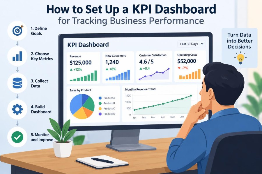
🛠️ Build a Practical First Version
Start with a small, credible version rather than attempting an enterprise-wide dashboard immediately. Choose one business unit, a limited number of high-value decisions, and data sources that are understood well enough to validate.
- Clarify objectives and decision questions.
- Select a balanced set of defined KPIs.
- Validate source data and calculation logic.
- Design a simple summary view with drill-downs.
- Test it in real review meetings and revise.
An early version will reveal missing data, confusing definitions, and unhelpful visuals. Finding these issues early is a strength, not a failure.
📉 Recognize When a Dashboard Is Not the Answer
Some management problems require qualitative investigation, customer interviews, process observation, or financial analysis that a standard dashboard cannot provide. A dashboard can signal an issue, but it cannot replace professional judgment.
It is also not a cure for unclear strategy, weak accountability, or unreliable systems. Publishing numbers without authority to act may increase frustration rather than improve performance.
Use dashboards as part of a wider management routine that includes discussion, experimentation, planning, and follow-through.
🌟 Make the Dashboard a Tool for Learning
The strongest dashboards do more than judge results. They help teams learn how their business works: which activities precede outcomes, where bottlenecks form, and which assumptions need revising.
When a team sees a recurring pattern, it can test a focused response and watch whether the relevant measures change. This creates a cycle of observation, action, and review.
A dashboard should therefore encourage curiosity alongside accountability. Numbers are most useful when they lead to better questions and better decisions.
✅ The Core Principle: Focus on Actionable Performance
An effective KPI dashboard is a carefully chosen view of the business, not a display of everything that can be measured. Its measures connect strategy to operations, its definitions can be trusted, and its review process leads to accountable action.
Choose KPIs that reveal outcomes and their drivers. Give each one a clear owner, sensible comparison, and appropriate target. Then use the dashboard consistently enough for patterns—and decisions—to become visible.
The aim is not perfect measurement. The aim is a shared, reliable basis for deciding what the business should do next.
A KPI dashboard succeeds when it helps people notice the right signal, understand it in context, and act before small performance gaps become larger problems. 📊🎯